
Responsive WordPress Web Design for UK Businesses
Tell us a little about what you’re looking for, and our team will be in touch to discuss how we can help.
A WordPress website can technically work on a phone and still be frustrating to use. Navigation may become awkward, headings may dominate smaller screens, tables may overflow, forms may be difficult to complete, and layouts that look balanced on desktop can lose their hierarchy as the available space changes.
Prime Lion Digital provides responsive WordPress web design for UK businesses that need their websites to work properly across desktop, tablet and mobile. We design and implement responsive behaviour around the content, components and functionality of the website rather than treating mobile as a smaller copy of the desktop layout.
For an existing WordPress website, that does not automatically mean rebuilding everything. We first consider what is causing the responsive problems and whether the current theme, templates and components can be improved proportionately. For a new website, responsive behaviour is planned as part of the design system from the beginning.
What Responsive WordPress Web Design Actually Means
Responsive web design is a system of layout and component behaviours that allows a website to adapt as the available viewport changes. The important part is not the number of device sizes covered. It is what happens to the content when there is no longer enough space for the desktop arrangement to remain useful.
A multi-column section may become two columns before eventually becoming one. A horizontal navigation may need a different interaction model. A comparison table may need horizontal scrolling or a different presentation. Images may require different crops, while buttons, forms and interactive elements need enough space to remain comfortable to use.
This is why responsive WordPress website design involves more than shrinking dimensions. It requires decisions about hierarchy, spacing, typography, component states, content order and interaction.
Why Mobile-Friendly Is Not Always the Same as Responsive
 A website may be described as mobile-friendly because it fits within a mobile viewport. That tells you very little about the quality of the experience.
A page can avoid horizontal overflow while still presenting poor navigation, oversized headings, inconvenient forms, tiny controls or a content order that made sense only on desktop. Responsive design addresses how the experience changes, not merely whether the page fits.
For business websites, this distinction matters because important journeys often involve more than reading text. Visitors may compare services, complete enquiry forms, navigate large menus, use filters, review tables or interact with other functionality that behaves differently when space becomes limited.
What Is Included in Our Responsive WordPress Web Design Service
The exact scope depends on whether we are designing a new website or improving an existing WordPress implementation. We focus on the elements that materially affect usability and content presentation across different viewport widths.
Responsive Page Layouts
We define how sections, grids, columns and content groups should adapt as space changes. Some layouts can compress gradually; others need a structural change before they become difficult to read or use.
Navigation and Mobile Menus
Desktop navigation cannot always be reduced into a hamburger menu without further thought. We consider menu depth, labels, sub-navigation, important actions and how users move between sections when the full desktop navigation is no longer visible.
Responsive Typography, Images and Content
Heading scale, line length, spacing and image treatment need to remain balanced at smaller widths. Images may require different proportions or crops, while content sometimes needs a different visual priority rather than simply appearing in the same order as desktop.
Forms, Tables and Interactive Elements
Forms need usable field sizes, labels and controls. Wide tables require an intentional strategy rather than allowing them to break the page. Tabs, accordions, sliders and other interactive elements also need behaviour that works with touch input and limited screen space.
Reusable WordPress Components
Responsive rules should remain reliable when components are reused elsewhere. We consider how cards, calls to action, content blocks and other recurring elements behave with different text lengths, images and combinations of content.
Responsive Testing and QA
Responsive QA is not limited to checking three screenshots. We review behaviour across relevant viewport ranges and test the points where layouts, navigation or components begin to lose usability.
Responsive Design Is About Behaviour, Not Device Sizes
Designing around a list of popular phones and tablets can create a false sense of completeness. There are too many viewport sizes, browser configurations and content variations for a website to be designed as a collection of fixed snapshots.
A more useful approach is to identify where the content or component stops working well.
| Element | Desktop Behaviour | Smaller-Screen Behaviour | Key Decision |
|---|---|---|---|
| Navigation | Full horizontal menu | Condensed or alternative navigation | When does the full menu become difficult to use? |
| Multi-column content | Several items displayed side by side | Fewer columns or stacked content | At what width does readability begin to suffer? |
| Typography | Larger scale with more available space | Adjusted size, spacing and line length | How can hierarchy remain clear without overwhelming the viewport? |
| Images | Wide or landscape presentation | Adjusted crop, ratio or placement | Does the important part of the image remain visible? |
| Tables | Several columns visible together | Scrolling or another suitable treatment | Which information must remain easy to compare? |
| Calls to action | May sit beside other content | May need stronger separation or full-width treatment | Does the action remain obvious without dominating the page? |
Mobile Design Is Not Just a Stacked Desktop Page
 Stacking desktop columns vertically is sometimes the correct response to limited space, but doing it automatically can create unnecessarily long pages and weak content hierarchy.
Mobile layouts often require decisions about priority. Supporting content may move below the primary action. A large visual element may need a different proportion. Navigation can require an entirely different interaction. A comparison that works horizontally on desktop may need another treatment on a narrow screen.
The objective is to preserve the purpose of the page while adapting how that purpose is delivered.
How Responsive WordPress Components Handle Real Content
Mock-ups are controlled environments. Real WordPress websites are not.
A card designed with a two-line title may later receive a four-line title. An editor may replace a landscape image with a portrait image. A call-to-action block may contain more copy than the original example. A service page may need an additional section six months after launch.
Responsive components therefore need to tolerate realistic content variation. Otherwise a website can look excellent at launch but become increasingly fragile as normal content changes are made.
There is also a practical balance between editor freedom and design stability. Giving editors unrestricted control over every spacing value, width and alignment can make a website flexible, but it can also make responsive consistency difficult to maintain. Reusable components with sensible controls often provide a better long-term editing experience.
This relationship between design and implementation is also important in custom WordPress web design, where component behaviour and CMS usability need to be considered together.
Common Responsive Problems on WordPress Websites
Some responsive problems are immediately visible. Others appear only with particular content, viewport widths or interactions.
| Problem | What the User Experiences | What May Need Reviewing |
|---|---|---|
| Navigation becomes crowded | Menu items wrap, overlap or become difficult to access | Navigation structure, breakpoint and mobile interaction |
| Headings dominate the screen | Important content is pushed too far down | Responsive typography and spacing |
| Tables overflow | Information is cut off or difficult to compare | Table behaviour and content priorities |
| Forms feel awkward | Fields and controls are difficult to complete on smaller screens | Field layout, input sizes, labels and spacing |
| Cards become inconsistent | Different content lengths create uneven or broken layouts | Component rules and content variation |
| Images crop badly | Important subjects or information disappear | Aspect ratios, focal points and responsive image treatment |
| Desktop interactions rely on hover | Touch users cannot access the same behaviour | Interaction design and alternative states |
The visible symptom does not always identify the underlying problem. An awkward mobile page might be caused by the CSS, the WordPress theme, a page builder, a component structure or the original design itself. Understanding that constraint first can prevent unnecessary redevelopment.
How We Approach Responsive WordPress Web Design
Responsive work starts with the actual website or project rather than a predetermined set of device mock-ups.
Review the Existing Website, Content and Page Types
For an existing site, we review the pages and components where responsive problems occur and consider the current theme, templates and implementation constraints. For a new project, we review the planned content, page types and available designs.
Define Responsive Behaviour
We determine what should resize naturally, what should rearrange and what needs a different interaction when available space changes. This includes navigation, content order, images, typography and interactive elements where relevant.
Design Component States
Reusable components need predictable behaviour. We consider their practical states rather than assuming that one desktop and one mobile example can describe every situation.
Implement the Responsive System in WordPress
The agreed behaviour is implemented within the relevant WordPress templates and components. The implementation approach depends on the existing website and project requirements.
Test With Real Content
Real content can expose issues that are invisible in idealised mock-ups. Testing realistic heading lengths, images, forms and content combinations helps identify fragile layouts before they become routine publishing problems.
Responsive QA
We review the website across relevant viewport ranges and focus particularly on transition points where navigation, layouts or individual components change behaviour.
If your project already has approved interface designs, our Figma to WordPress service covers the implementation of supplied designs into WordPress, including the responsive decisions required to make them work beyond static design frames.
New Responsive Website or Improve the Existing Site?
The appropriate scope depends on what is already working and where the limitations sit.
| Situation | Likely Direction | Why |
|---|---|---|
| New WordPress website | Plan responsive behaviour as part of the design and build | Layouts and components can be designed responsively from the beginning |
| Existing site works well but has specific mobile issues | Targeted responsive improvements may be sufficient | The useful parts of the current implementation may not need replacing |
| Layouts and navigation are problematic across much of the site | A broader redesign may be appropriate | The problem may sit in the website structure rather than isolated responsive rules |
| Existing theme or implementation creates fundamental constraints | More substantial redevelopment may need to be considered | Repeated workarounds can become less practical than addressing the underlying structure |
| Primary problem is loading performance | Performance optimisation may be the better starting point | Responsive layout changes do not automatically resolve performance issues |
Responsive Design, Performance, Accessibility and SEO
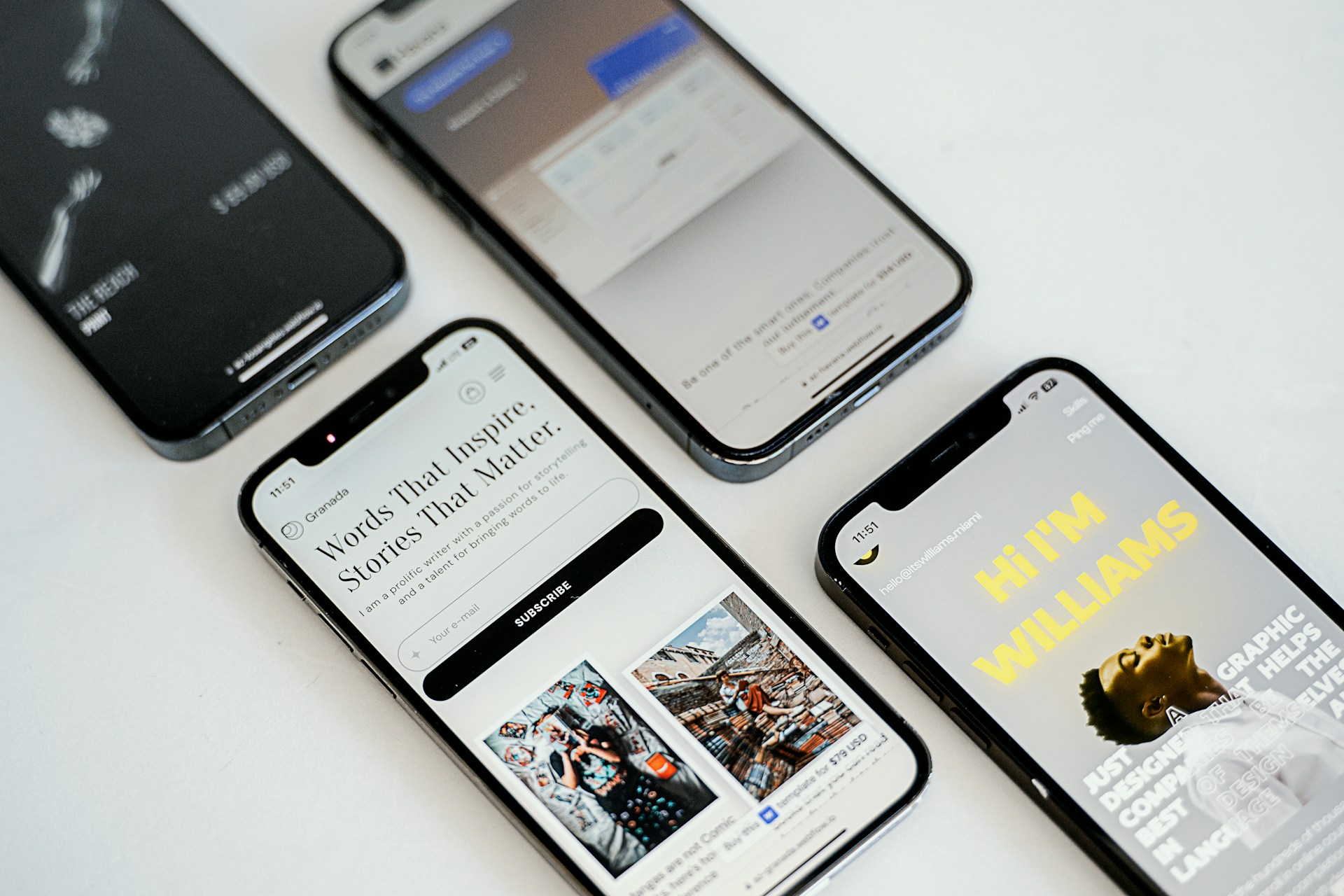 Responsive design overlaps with performance, accessibility and search, but these are separate disciplines. A layout can adapt correctly and still load slowly. A technically responsive menu can still be difficult to use with a keyboard. A page can display well on mobile while retaining broader technical SEO issues.
Responsive decisions can nevertheless influence each area. Large media, hidden desktop elements and unnecessary interface complexity may affect performance. Content order and interaction choices can affect accessibility. Mobile usability can also influence how easily users consume and navigate content.
Where the underlying issue is primarily speed or Core Web Vitals, see our website performance optimisation service. Broader crawling, indexing and technical search issues belong within technical SEO.
How Much Does Responsive WordPress Web Design Cost?
The cost depends on the scope and condition of the website rather than a universal price per page. No single page count reliably describes responsive complexity.
A website with many pages may use a small number of well-structured templates. Another site may contain fewer pages but require complex navigation, tables, forms, interactive elements or inconsistent components that need individual attention.
Factors that can affect scope include:
- whether the project is a new website or an existing WordPress site;
- the number and complexity of templates and reusable components;
- the condition of the current theme or page-builder implementation;
- navigation complexity;
- forms, tables and interactive functionality;
- whether responsive designs already exist;
- the amount and variation of real content that needs to be tested;
- the extent of responsive QA required.
For an existing website, reviewing the current URL and the problem areas usually provides a better basis for scoping than page count alone.
What Affects the Project Timeline?
Timing depends on the same underlying complexity. A focused correction to several existing components is a different project from defining responsive behaviour across a new website or resolving structural limitations in an older implementation.
Important dependencies can include the condition of the existing WordPress setup, availability of designs and content, the number of reusable components, required functionality, approvals and the issues identified during testing. We do not assume a fixed delivery period before the scope is understood.
Is Responsive WordPress Web Design Right for Your Website?
This service is relevant when the main problem is how a WordPress website behaves as screen space changes: layouts break, navigation becomes awkward, content hierarchy weakens, components become inconsistent or mobile interaction is noticeably poorer than desktop.
It may not be the right starting point when the underlying problem is broader.
- If the existing website needs substantial changes to its structure, visual direction and user journeys, consider WordPress website redesign.
- If you need a new bespoke design system rather than responsive improvements to an existing design, see custom WordPress web design.
- If you are planning the wider design of a new WordPress website, start with our WordPress web design service.
Separating these needs matters because responsive design should solve responsive problems rather than becoming a catch-all label for every website change.
Relevant WordPress and Website Experience
Prime Lion Digital’s broader website work includes Audit Consulting Group, Freizeit Camper and Construction & Repair Work. These projects demonstrate wider website and WordPress delivery experience rather than being presented as dedicated responsive WordPress case studies.
For responsive projects, our focus is on the practical details that affect the finished website: how layouts behave with real content, how reusable components respond to change, how editors can continue managing the site, and whether the proposed scope addresses the actual problem rather than replacing working parts unnecessarily.
Frequently Asked Questions
What is responsive WordPress web design?
Responsive WordPress web design is the design and implementation of WordPress layouts and components so they adapt appropriately as available screen space changes. It covers more than resizing pages and can include navigation, typography, content order, images, forms, tables, reusable components and interaction behaviour.
Is WordPress responsive by default?
WordPress itself does not guarantee that every website built with it will provide a good responsive experience. The result depends on the theme, templates, plugins, page-builder configuration, custom components, content and the responsive decisions made during design and development.
Is responsive design the same as mobile-friendly design?
Not necessarily. A mobile-friendly page may simply fit within a smaller viewport. Responsive design considers how layouts, content hierarchy, navigation and interactions should change when space becomes limited.
Do I need separate desktop, tablet and mobile designs?
Not always. Key states can be useful, especially for complex interfaces, but a responsive website must also work between those states. Component behaviour and content breakpoints are therefore as important as individual design frames.
Can you make an existing WordPress website responsive?
Potentially, yes. The first step is to understand whether the problem can be addressed within the existing theme and component structure. Some websites need targeted improvements; others have broader structural constraints that make redesign or redevelopment more appropriate.
Do I need to rebuild my website to improve mobile usability?
No. A rebuild should not be assumed before the existing implementation is reviewed. If the core website is sound, responsive improvements to navigation, templates or components may be sufficient. More substantial work becomes relevant when the underlying structure repeatedly prevents reliable improvements.
How much does responsive WordPress web design cost?
Cost depends on the number and complexity of templates and components, the current WordPress implementation, navigation, forms, tables, interactions, available designs and testing requirements. We assess the project scope before providing a price rather than applying a fixed figure based only on page count.
Does responsive design affect SEO and website performance?
Responsive decisions can influence usability, content presentation and performance, but responsive design does not replace technical SEO or performance optimisation. If speed, Core Web Vitals, crawling or indexing are the primary problems, those areas should be assessed separately.
Discuss Your Responsive WordPress Website
If you are planning a new responsive WordPress website or need to improve an existing one, send us the current website URL or a brief outline of the project. For an existing site, it is useful to identify the pages, components or mobile problems causing the most difficulty. If designs already exist, you can include those as well.
Prime Lion Digital can review the requirements with you and discuss whether focused responsive improvements, a broader redesign or another WordPress approach is the more proportionate next step.
Contact Prime Lion Digital to discuss your responsive WordPress project.