Print Design Services in the UK
Print Design That Works Physically, Commercially and Visually
Print design is easy to underestimate until something arrives from the printer looking different from what everyone expected.
A brochure that looked clean on screen suddenly feels crowded in the hand. Colours appear duller than the brand guidelines suggested. A premium leaflet feels cheap because the paper stock does not match the positioning. Small typography becomes difficult to read under office lighting. An exhibition banner that looked balanced in a PDF becomes unclear from three metres away.
These problems happen more often than businesses realise.
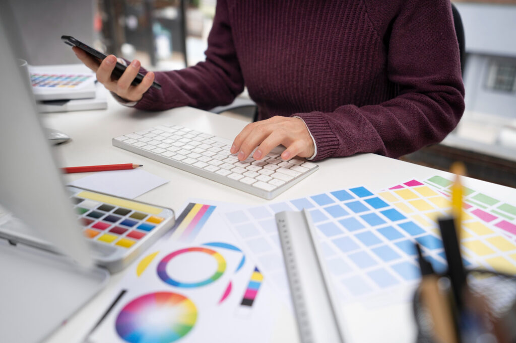
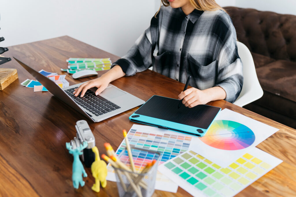
At Prime Lion Digital, we provide professional print design services for UK businesses that need printed materials to look credible, communicate clearly and work properly in real-world conditions.
We do not treat print as decoration. We treat it as a physical brand experience. People hold printed materials, compare them, scan them quickly, pass them across meeting tables, keep them after events and sometimes judge the quality of a business before reading a single full paragraph.
That is why good print design has to consider far more than layout alone. It needs to account for readability, print production, paper choice, colour behaviour, viewing distance, physical handling and the subconscious impression the material creates.
Why Print Design Still Matters in a Digital-First World
Digital marketing may dominate most business conversations, but print still plays a powerful role in moments where trust, attention and physical presence matter.
Printed materials often appear in higher-value environments: sales meetings, exhibitions, product packaging, client onboarding, proposals, corporate events and premium brand interactions. These are not casual touchpoints. They are moments where people are actively judging credibility.
A strong printed brochure can make a company feel established. Poorly produced print can have the opposite effect very quickly.
We regularly see businesses investing heavily in websites and digital campaigns while their printed materials feel outdated, inconsistent or disconnected from the brand they are trying to build. That gap weakens perception because customers do not separate online and offline impressions. They experience the brand as one whole system.
A professional print design agency should understand this connection. Print should not feel like an afterthought. It should reinforce the same level of quality, confidence and clarity that customers see across your website, presentations, packaging and wider marketing materials.
Print Design Is Not Just About Making Things Look Good
One of the biggest mistakes businesses make is assuming print design is mainly visual.
It is not.
Print design is communication under physical constraints.
A flyer has to be understood quickly. A brochure has to support a conversation. Packaging has to communicate value before the customer has time to think deeply. A corporate report has to remain readable across dozens of pages. Event signage has to work from a distance, not just in a designer’s preview window.
Many businesses obsess over finishes, foil effects and premium paper while the actual message remains difficult to scan. Others try to include everything in one brochure because internal teams are afraid to remove information. The result is often a printed asset that feels busy, expensive and unclear at the same time.
Strong print design creates order. It helps the reader understand what matters first, what supports the message and what action should happen next.
That is where the difference between a basic print company and a strategic print design company becomes very clear.
Why DIY Print Design Often Creates Expensive Problems
Template platforms have made it easier to create printed materials, but they have also created a false sense of safety.
If something looks acceptable on screen, many businesses assume it is ready for print.
Print does not work that way.
We regularly see businesses run into problems with incorrect colour setup, missing bleed, unsafe margins, low-resolution images, weak contrast and typography that becomes unreadable once printed. Sometimes these problems are only noticed after the materials have already been produced, which means wasted budget, delayed campaigns and uncomfortable conversations with printers.
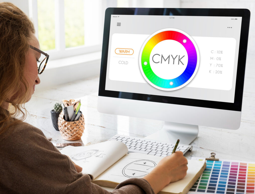
One of the most common issues is colour mismatch. A design created in RGB can look bright and impressive digitally but reproduce differently in CMYK. Another common problem is trimming. Important content placed too close to the edge can be cut during production because safe areas were ignored.
These are not small technical details. They affect how professional the business appears.
A reliable print agency should understand how design behaves after it leaves the screen and enters production.
Designing for the Physical Environment
Print exists in the real world, and the real world is rarely as controlled as a design preview.
A brochure may be read under warm office lighting. A menu may be handled repeatedly throughout the day. A product insert may be opened quickly and scanned in seconds. An event banner may need to communicate clearly from several metres away while surrounded by visual noise.
That context changes the design decisions.
Thin typography may look elegant on a high-resolution monitor but become weak on textured paper. Low-contrast layouts may feel premium in a mockup but become difficult to read in poor lighting. A complex packaging design may look balanced alone but lose impact completely when placed beside competing products on a shelf.
This is why we design print materials around physical use, not just digital presentation.
We consider scale, reading distance, material choice, folding, binding, ink behaviour, paper texture, handling and durability. These details quietly shape how people perceive quality.
The Psychology of Print, Touch and Perceived Value
Print creates a sensory impression that digital content cannot fully replicate.
People feel paper weight. They notice texture. They sense whether packaging feels premium or cheap before consciously analysing the design. They judge whether a brochure feels considered, rushed, mass-produced or carefully made.
This matters because perceived value is often influenced by physical cues.
A flimsy business card can weaken a premium brand. A poorly finished brochure can make a strong company feel less established. Packaging that promises quality visually but feels cheap physically creates an immediate disconnect between expectation and experience.
Good print design understands this relationship between visual identity and tactile perception.
The goal is not always to choose the most expensive finish. The goal is to choose materials and design decisions that support the brand position honestly and effectively.
Print Design as Part of a Wider Brand System
One of the most common problems we see with growing businesses is brand fragmentation.
The website looks modern. Social media feels polished. Presentations have been redesigned. But brochures, flyers, packaging inserts or exhibition materials still look like they belong to an older version of the business.
This creates friction.
Customers may not consciously say, “the print materials are inconsistent with the website,” but they feel the difference. The brand starts to look less organised and less trustworthy.
We design print as part of a wider brand system. Typography, colour, layout rhythm, spacing, image style and messaging should feel connected across digital and physical touchpoints.
Consistency does not mean every asset should look identical. It means the brand should feel recognisable wherever someone encounters it.
Print Design for Sales and Client Communication
Printed sales materials often support conversations where trust matters immediately.
A brochure, capability document, printed proposal or company profile should help the conversation flow. It should not force the client to work hard to understand what the business does, why it matters or why they should care.
Many printed sales materials fail because they try to say everything at once.
Dense paragraphs, generic stock images, crowded layouts and weak hierarchy make the document feel heavy. In meetings, this creates a strange problem: the material exists to support the conversation, but instead it slows the conversation down.
We design printed sales assets around clarity, pacing and commercial usefulness. The reader should be able to understand the key points quickly, scan supporting information comfortably and remember the business more clearly after the meeting.
A strong printed sales asset should feel like a strategic tool, not a decorative handout.
Packaging Design Is About Perception, Usability and Shelf Reality
Packaging is one of the most sensitive areas of print design because it directly affects perceived product value.
Customers make fast judgements from packaging. They assess quality, trust, category fit and price expectation before reading every detail.
This is where many businesses make mistakes.
Some packaging designs look attractive in isolation but become weak in a retail environment. Others focus so heavily on visual style that product information becomes difficult to find. Some brands try to look premium using finishes and effects while the hierarchy remains confusing.
Effective packaging needs to balance shelf visibility, product clarity, compliance information, readability, material quality and brand positioning.
A packaging design that feels premium digitally but cheap physically creates immediate distrust. A design that looks bold but hides key information creates usability problems. A design that ignores shelf competition may disappear beside stronger competitors.
We approach packaging as both a brand asset and a physical customer experience.
Typography and Readability in Print Design
Typography behaves differently in print than it does on screens.
Some font weights that look refined digitally become weak after printing. Small text that feels readable on a monitor can become frustrating on textured paper. Long line lengths can make brochures tiring to read. Poor spacing can make even good content feel heavy.
Good typography in print is often invisible when it works well.
The reader simply moves through the material without friction.
We pay close attention to font suitability, line spacing, layout rhythm, heading hierarchy and readability across different viewing distances. This matters for brochures, reports, menus, packaging, catalogues, signage and editorial documents.
Poor typography creates resistance. Strong typography creates confidence.
Print Production Knowledge Matters
A print project can fail during production even when the design itself looks strong on screen.
This is one of the reasons production knowledge matters so much.
We prepare print-ready files with proper attention to CMYK colour setup, bleed, crop marks, safe margins, image resolution, large-format scaling and printer specifications.
But production awareness is not only technical. It also affects design decisions earlier in the process.
If a piece will be folded, the layout must respect the fold. If a design will be printed large-format, typography and image resolution need to be planned accordingly. If a premium material is being used, colour and contrast need to be tested against the finish.
This practical understanding helps reduce reprint risk and improves the final result.
Print Design Pricing in the UK
Print design pricing depends on the type of asset, content volume, number of pages, production requirements and the level of strategic design work involved.
A simple business card or flyer requires a very different level of planning compared to a multi-page brochure, product catalogue, corporate report, packaging system or exhibition campaign.
We avoid unrealistic fixed-price promises that ignore production complexity.
Factors that usually affect scope include page count, content preparation, image sourcing, print specification, format adaptation, turnaround time and whether the project requires a reusable system rather than a single asset.
Our focus is not low-cost artwork production. It is creating printed materials that strengthen brand perception, communicate clearly and avoid expensive production mistakes.
Our Print Design Services
Prime Lion Digital provides print design support across a wide range of business, marketing and brand communication needs.
Our print services include brochure and leaflet design, business cards, stationery systems, corporate reports, company profiles, sales collateral, printed presentations, event graphics, exhibition materials, packaging assets, posters, signage, large-format graphics, presentation folders and branded documentation.
Some businesses need one important printed asset designed properly. Others need a scalable print system that keeps materials consistent across campaigns, departments or locations.
Both require a different level of strategic thinking, and both need design decisions that make sense once the material is physically produced.
Case Studies
Case Study 1 — Professional Services Brochure Redesign
Industry: B2B Professional Services
Project Scope: Corporate brochure redesign
Format: 24-page printed company brochure
Timeline: 2 Weeks
The client used an outdated brochure during meetings with prospective corporate clients. The material contained dense paragraphs, inconsistent layouts and weak visual hierarchy, making it difficult for the sales team to use naturally during conversations.
The first challenge was internal. Different stakeholders wanted different sections kept, even though several pages repeated the same message. We helped reduce unnecessary content, improve section flow and rebuild the brochure around how prospects actually scan printed material during meetings.
We created a clearer typography system, improved visual pacing, strengthened brand consistency and prepared professional print-ready production files.
After the redesign, the sales team reported:
- 46% stronger engagement during client meetings
- 31% shorter average brochure-led sales conversations
- better prospect feedback on professionalism
- stronger consistency between website and printed materials
- fewer internal revisions due to a clearer brochure structure
Case Study 2 — Consumer Brand Print System
Industry: Consumer Retail
Project Scope: Multi-format print collateral system
Timeline: 3 Weeks
The brand used inconsistent flyers, packaging inserts and event materials across campaigns and retail locations. Some assets looked modern, while others felt disconnected from the main brand identity.
This inconsistency was creating confusion internally and weakening recognition at physical touchpoints.
We developed a scalable print design system covering promotional flyers, packaging inserts, event collateral, retail display materials and brand-consistent layout templates.
The new system delivered:
- 58% improvement in cross-campaign visual consistency
- 37% faster internal production of repeat print assets
- stronger brand recognition during in-person events
- better alignment between digital campaigns and printed collateral
- reduced design fragmentation across retail locations
Case Study 3 — Product Packaging Redesign
Industry: Retail Product Business
Project Scope: Packaging redesign and print production setup
Timeline: 4 Weeks
The business needed packaging that reflected a more premium market position while improving usability and shelf visibility.
The original packaging had weak contrast, unclear information hierarchy and production choices that made the product feel less premium than intended.
We redesigned the packaging system around stronger shelf presence, clearer product messaging, improved typography and more suitable production specifications.
Following the redesign, the business saw:
- 42% improvement in shelf visibility during retail review
- 29% increase in product pick-up interest during sampling activity
- stronger perceived product quality from customer feedback
- better alignment between packaging and wider brand positioning
- fewer production issues due to improved print setup
FAQ
Can you prepare CMYK print-ready files?
Yes. We prepare professional print-ready files with correct CMYK colour setup, bleed, safe margins, crop marks and production specifications where required.
Can you work with our printer’s specifications?
Yes. We can adapt artwork to printer guidelines, technical requirements, material specifications and production methods.
Can you redesign old brochures or printed materials?
Yes. Many clients come to us with brochures, reports, flyers or packaging that no longer reflect the quality of their business. We can restructure the content, improve the design and prepare updated files for professional printing.
Do you help choose paper stock and finishes?
Yes. We can advise on paper stock, finishes, textures and production considerations so the final printed material supports the intended brand position rather than working against it.
Can you create print and digital versions of the same brochure?
Yes. We often create both print-ready and digital-friendly versions of brochures, reports and sales materials so businesses can use them across meetings, email, websites and campaigns.
Do you provide editable source files?
Editable files can be supplied where appropriate depending on the project scope and agreed deliverables.
How long do print design projects usually take?
Timelines depend on complexity, number of assets, revisions and print production requirements. Many brochure, collateral and packaging projects are completed within 1–4 weeks.
Ready to Improve the Quality of Your Printed Brand Materials?
If your print materials feel outdated, inconsistent or disconnected from your wider brand identity, professional print design can significantly improve how your business is perceived offline.
Contact Prime Lion Digital to discuss your brochure design, packaging, corporate print or wider print design requirements.