
Leave your details and our team will get back to you shortly to discuss your website, SEO or digital growth project.
Responsive Website Design Services for UK Businesses
Prime Lion Digital provides responsive website design for UK businesses that need websites to work properly across mobiles, tablets, laptops and larger desktop screens without compromise. Our work combines layout planning, UX thinking, front-end build quality and conversion-focused structure, so the site is not simply “mobile friendly” in a basic sense, but genuinely usable, fast and commercially effective on the devices your customers actually use.
If you are comparing responsive website design services, the practical question is usually not whether a site should adapt to different screens. It should. The real question is whether that adaptation has been thought through properly: navigation, call-to-action placement, speed, forms, readability, image handling, content hierarchy and lead flow. That is where many redesigns fall short.
For broader project context, some businesses start with our website design services, while others need a more tailored solution from the outset.
What responsive website design actually includes
Our responsive web design service covers more than making pages shrink to fit smaller screens. A proper delivery process looks at how people browse, compare, enquire and buy when they are on the move, using one hand, switching between devices or returning later on desktop to complete an action. That affects both design and development decisions.
In practical terms, responsive website design services usually include discovery, wireframing, page structure planning, mobile-first UX decisions, front-end layout development, device testing, speed review, form usability checks and post-launch refinement. Where needed, we also handle responsive web design and development together, which is often the best route when an older site has structural limitations that cannot be solved with visual tweaks alone.
We regularly work on brochure sites, lead generation websites, service-led company sites and more complex builds where responsive behaviour needs to support SEO, accessibility and conversion goals at the same time.
Who this service is for
This service suits businesses whose websites are attracting mobile traffic but not converting as well as they should. It also fits companies planning a redesign, migrating from an outdated platform, launching a new brand, or trying to improve lead quality without rebuilding their wider marketing from scratch.
It is especially relevant for firms where the buying journey starts on mobile but often finishes later. That includes local service companies, professional services, B2B providers, multi-location businesses, startups and established firms with ageing websites. If that sounds familiar, our related work in small business website design may also be relevant.
A good fit is a business that understands the website is not just there to look presentable. It needs to support enquiries, sales conversations, credibility and discoverability.
Common business problems we solve
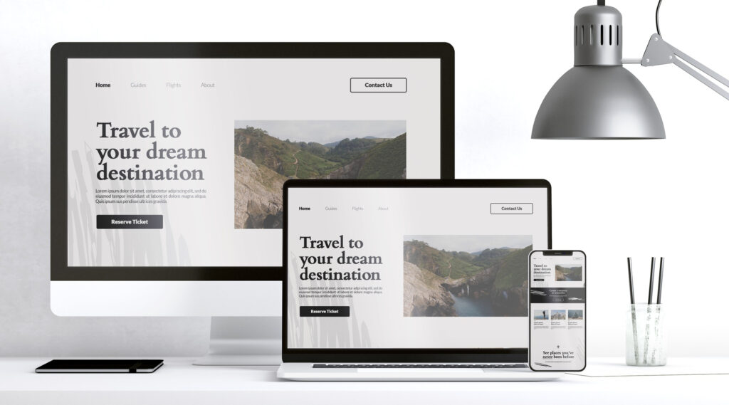 Many businesses come to us after noticing a pattern rather than one obvious failure. Mobile traffic looks healthy in analytics, yet enquiries remain flat. Pages appear acceptable on a phone at first glance, but visitors still drop off quickly. Forms work technically, but are awkward to complete. Navigation becomes cluttered. Key trust signals disappear below the fold. On some devices, image-heavy pages load too slowly.
We also see problems caused by desktop-led redesigns where the mobile version was treated as a final tidy-up task. That often leaves the most important journeys weakened: calling, booking, requesting a quote, downloading information or finding the right service page quickly.
For businesses running campaigns or SEO activity, these issues are expensive. You may be paying to attract traffic that your site is poorly equipped to convert.
Types of responsive website design solutions we provide
Not every project needs the same answer. In some cases, the right solution is a full rebuild with responsive web design & development from the ground up. In others, a focused redesign of core templates, navigation and conversion paths is enough to improve performance meaningfully.
We provide mobile responsive website design for new websites, redesigns of underperforming existing sites, responsive rebuilds on WordPress and other platforms, landing page systems for campaigns, and design support for businesses moving away from restrictive builders. Where template adaptation is not enough, a more tailored bespoke website design route is often the better long-term answer.
We also support specialist use cases. A B2B firm may need complex service content presented clearly across devices, while a local trade business might need fast mobile enquiry journeys first. That is why we do not force every client into the same template or process.
Typical investment and pricing expectations
Pricing for responsive website design services depends on what is being fixed, replaced or built. A smaller responsive redesign for a straightforward service business website may sit in a different bracket to a bespoke lead generation site with custom templates, copy support, advanced forms, migration work and technical SEO considerations.
In general, the main cost drivers are page count, content complexity, design depth, platform constraints, custom functionality, integrations, migration risk and how much existing material can realistically be reused. A low-cost visual refresh may improve appearance, but it rarely solves deeper UX and performance issues if the underlying structure is weak.
We are usually candid about where investment creates a real return and where it does not. Some businesses need a carefully planned lean build. Others are better served by a more strategic lead generation website design project because the website plays a direct role in revenue.
Project timelines and delivery expectations
Most responsive website design projects take anywhere from a few weeks to a few months, depending on scope and decision speed. A smaller responsive redesign with clear content and limited technical dependencies may move quickly. A larger build involving content refinement, platform migration, bespoke functionality, multiple feedback rounds and careful SEO preservation naturally takes longer.
One of the most common causes of delay is not development. It is unresolved content, changing priorities or unclear stakeholder input. We plan for that, because in real projects the website is rarely the only thing happening inside the business.
We set delivery expectations around milestones rather than vague promises. That tends to make projects calmer and more predictable.
How the process works
Our process starts with understanding how the site needs to perform commercially, not just how it should look. We review the current website, device behaviour, user journeys, friction points, conversion goals and the practical constraints of your platform or existing stack.
From there, we define page structures, mobile priorities, navigation logic and visual direction. Once those foundations are right, design and front-end implementation move much more smoothly. We test responsive behaviour throughout rather than leaving device checks until the end, because issues found late are slower and more expensive to fix.
Where appropriate, we combine responsive web design and development in one managed process so design intent, usability and build quality stay aligned. That matters. A strong-looking design can still fail if development shortcuts create layout shifts, poor image handling or awkward mobile interactions.
Who works on the project
Responsive websites are rarely improved by a single discipline working in isolation. Depending on scope, your project may involve a strategist, designer, developer and SEO-aware content or UX input. That does not mean a bloated team. It means the right decisions are made by people who understand the knock-on effects of those decisions.
For example, a designer may simplify a mobile layout, but a developer needs to ensure that change performs properly across breakpoints and browsers. Equally, a strategist may recommend shortening an enquiry journey, but it must still preserve the trust signals buyers need before submitting a form.
That joined-up thinking is part of what businesses expect from a responsive website design agency rather than a purely visual freelancer or theme installer.
Platforms, technologies and integration considerations
We commonly deliver responsive work on WordPress, including custom and semi-bespoke builds, though the right setup depends on the project. In some cases, an existing CMS can be improved. In others, it makes more sense to rebuild around a cleaner structure to avoid carrying technical debt forward.
Responsive performance is affected by far more than templates. Image formats, font loading, CSS structure, plugin weight, form handling, third-party scripts, hosting quality and tracking setup all play a part. Businesses sometimes underestimate this and assume mobile issues are “just design”. Often they are not. We also review page speed, responsive images, Core Web Vitals and how content behaves across real screen sizes rather than relying on one emulator view.
If your project sits within a broader service structure, we can also align it with B2B website design requirements where longer buying journeys, layered service content and multi-stakeholder decision-making need extra care on smaller screens.
Industries and business types we work with
Responsive website design is relevant across sectors, but user behaviour varies by audience. A professional services company may need authority, clarity and friction-free enquiry forms. A local service business may rely on call actions and quick mobile trust cues. A B2B company often needs more layered service information that still reads cleanly on smaller screens. Startups usually need flexibility for future growth without overbuilding too early.
We shape the approach around the commercial model, buying cycle and content demands of the business rather than forcing one layout system onto every industry.
What clients often underestimate
The biggest misconception is that a responsive site is simply a desktop site that “stacks nicely” on mobile. In reality, mobile browsing changes user behaviour. Attention is shorter. Navigation tolerance is lower. Long dense content blocks become harder to scan. Forms feel more demanding. Even minor delays in load time or interaction can increase drop-off.
Another common blind spot is content hierarchy. On desktop, a page may still function because there is space to show multiple messages at once. On mobile, those same messages become a sequence. If the order is wrong, trust and relevance can weaken before the user reaches the action point.
That is why mobile responsive website design should be planned, not patched.
Why similar projects often fail
Most failed responsive redesigns are not caused by a lack of effort. They fail because the project was driven by surface-level goals: make it look newer, copy a competitor, install a modern theme, shorten the timeline, or reduce scope in the wrong places. The result may appear updated, yet still perform poorly in real use.
Another issue is handing responsibility to disconnected providers. Design decisions get made without technical context. Development choices get made without UX priorities. Content is added too late. SEO considerations are bolted on after launch. At that point, the site may be responsive in a technical sense, but commercially weaker than it should be.
A credible responsive website design services company should be able to explain these risks before the project starts, not after.
Buyer guidance before choosing a responsive website design agency
If you are comparing providers, ask how they approach mobile hierarchy, not just mobile compatibility. Ask how they test forms, calls to action and conversion journeys across devices. Ask whether they are rebuilding templates or solving the underlying user flow. Ask what happens to page speed once designs become more visual. And ask how launch is handled, especially if rankings, content URLs or existing enquiries matter.
You should also be wary of proposals that feel unusually cheap relative to what is being promised. Responsive work can be efficient, but it is not magic. If a project involves strategy, custom layouts, development, testing and migration, there is real delivery effort behind it.
The better question is not “what is the cheapest way to get a new responsive site?” It is “what level of work is needed to make the site genuinely more useful and commercially stronger?”
Should you choose bespoke, template-led or a focused redesign?
There is no single correct route. A bespoke build is often the right fit when brand positioning, content structure, lead generation or platform limitations require more flexibility. A template-led approach can be sensible for smaller businesses with simpler needs, provided it is implemented properly and not overloaded. A focused redesign works well when the existing site already has decent foundations but poor mobile usability, dated templates or conversion friction.
For some businesses, comparing responsive website design against a broader website project helps clarify scope. For others, the real comparison is between adapting what exists and investing in a more future-proof bespoke solution.
We will usually recommend the route that solves the actual business problem, even if that means a smaller project than the original brief suggested.
Results and business impact
When responsive design is done properly, the gains are rarely limited to appearance. Businesses usually see improvements in usability, engagement quality, enquiry completion, mobile conversion rate, readability, trust and speed. In some cases, SEO performance also improves because the site becomes easier to crawl, faster to load and more aligned with user behaviour.
That said, outcomes depend on starting point. A strong site with minor mobile friction will not show the same jump as an outdated website losing a high proportion of mobile users. We try to set realistic expectations early, because that leads to better decisions and fewer disappointments later.
Examples of Project Outcomes
A regional service business had an ageing brochure site that looked acceptable on desktop but was difficult to use on phones.
Problem: High mobile drop-off, weak enquiry flow and slow template performance.
Work delivered: Reworked page hierarchy, simplified mobile navigation, rebuilt service templates and improved responsive image handling.
Result: Mobile bounce rate reduced by just over 30% and form enquiries increased from low single figures to around 25 per month within one quarter.
Commercial meaning: The site became more usable for the audience most likely to enquire outside office hours.
A B2B company needed responsive web design & development for a lead-focused website supporting longer buying journeys.
Problem: Decision-makers could access the site on mobile, but key pages were cramped and forms were poorly structured.
Work delivered: Created clearer responsive layouts, improved content spacing, shortened enquiry forms and strengthened CTA placement across device sizes.
Result: Average session duration increased by more than 40% and lead quality improved according to the client’s sales team.
Commercial meaning: Better mobile usability supported research-stage visitors without overcomplicating the site.
A growing local company wanted a redesign after outgrowing a restrictive builder setup.
Problem: The existing website was difficult to update, inconsistent across devices and held back conversion pages.
Work delivered: Moved the site into a more flexible build, introduced mobile-first page templates and improved page speed across core service pages.
Result: Load times on priority pages improved by roughly 63%, with a noticeable lift in phone calls and contact form completions.
Commercial meaning: The redesign gave the business a site it could actually use and maintain rather than work around.
What happens after launch
Launch is not the end of the useful work. It is the point where real user behaviour starts to confirm which decisions were right and which need refinement. After launch, we review device behaviour, conversion patterns, page interaction and any issues surfaced by real users.
Sometimes the changes are small: adjusting button placement, shortening a form, refining spacing or improving content order on specific templates. Occasionally, launch data reveals a deeper opportunity. Either way, a responsive site should be treated as a live business asset, not a finished brochure.
Communication and reporting
We keep communication clear and tied to delivery decisions rather than hiding behind vague progress language. During the project, that typically means agreed checkpoints, feedback rounds, scope clarity and practical updates on what is being designed, built or tested. After launch, reporting can focus on the metrics that actually matter for the website’s role: device engagement, enquiry behaviour, speed improvements and page-level performance.
Clients tend to value straightforward communication because website projects can become unnecessarily confusing when too many decisions are dressed up in technical jargon.
Why businesses choose Prime Lion Digital
Businesses usually choose Prime Lion Digital because they want a responsive website design agency that looks beyond surface aesthetics. We pay attention to how pages behave, how visitors move through the site, where trust is won or lost and how design choices affect commercial outcomes. The work is not approached as a one-size-fits-all template exercise.
We also understand that buyers often compare specialist options. Some need a lean responsive refresh. Some need a strategic rebuild tied to lead generation. Some need a broader web partner with experience across service-led business sites.
Just as importantly, we are realistic. Not every website problem needs a full rebuild, and not every business needs the most elaborate solution. Good advice should help you buy appropriately, not simply spend more.
Frequently asked questions
What is the difference between responsive website design and a normal website design project?
Responsive website design focuses specifically on how the website adapts and performs across devices. In reality, it is often part of a wider website design project, but on this page the emphasis is on mobile usability, layout behaviour, speed, readability and conversion performance across screen sizes.
Do you offer responsive web design and development together?
Yes. Many projects are handled as responsive web design and development so that strategy, design and implementation remain aligned. That usually leads to better outcomes than separating design from build.
Can you improve an existing site rather than rebuild it?
Sometimes, yes. If the core platform and structure are sound, a focused redesign can improve responsive performance without a full rebuild. If the site has deeper technical or structural limitations, rebuilding may be more cost-effective in the long run.
Will a responsive redesign improve SEO?
It can help, especially if the current site has usability, speed or structural issues. But SEO gains are not automatic. A better responsive experience supports stronger performance; it does not replace broader SEO work.
How much does mobile responsive website design cost?
It depends on scope, complexity and whether the project is a refresh, redesign or full rebuild. We scope around business goals, not generic packages, because pricing without context is usually misleading.
Can you work within our existing CMS?
Often, yes. We assess whether the current CMS, theme and plugin setup can support the required layouts, speed targets, forms and editing workflow. If not, we will explain whether a partial rebuild or full migration is the more sensible route.
How do you test responsive behaviour before launch?
We check layouts, navigation, forms, responsive images and interaction points across common breakpoints, browsers and device types. We also review page speed and mobile usability issues that can affect real visitors even when a page looks visually correct.
Do you work with smaller businesses as well as larger companies?
Yes. The right approach differs by stage and budget. Some businesses are best suited to small business website design, while others need a more involved custom build.
Speak to Prime Lion Digital about responsive website design
If you are assessing whether your current site is costing you enquiries, or planning a new build that needs to perform properly across devices, we can help you evaluate the most sensible route. That may be a focused responsive web design service, a broader rebuild, or a more bespoke solution depending on the condition of the current site and the commercial role it needs to play.
If you would like a practical conversation about scope, likely investment, delivery considerations and whether a redesign is justified, contact Prime Lion Digital. We will give you a clear view of what needs improving, what can stay, and what is likely to make the biggest difference.