
Responsive Website Development Services in the UK – From £800
Prime Lion Digital (PLD) provides responsive website development services for UK businesses that need fast, accessible and usable website layouts across mobile, tablet, laptop and desktop screens. Whether you need responsive frontend development from approved Figma designs, a new content-managed website or improvements to existing templates, we turn design requirements into working pages, components and interactions. Responsive web development projects start from £800, with deliverables, testing and any integrations agreed in a written quotation before work begins. If you are looking for a responsive web development company in the UK, PLD can help turn approved designs and technical requirements into working responsive pages, reusable components and usable customer journeys.
Get a Responsive Development Quote | Explore Our Portfolio
Choose the Responsive Development Work You Need
Not every business needs a complete redesign. The appropriate starting point depends on what already exists, what needs to work and how much of the website is changing.
| Your situation | What PLD can develop | What to provide |
|---|---|---|
| New website | Responsive page templates, reusable components and agreed functionality for a new build. | Business goals, page requirements, content and any preferred platform. |
| Approved design ready for development | Working frontend pages from approved Figma or equivalent design files, including agreed interactions and responsive states. | Design files, component states, content and technical requirements. |
| Existing website needs improvement | Targeted changes to layouts, navigation, tables, forms or templates where the current platform permits. | Website URL, platform details and examples of the affected pages. |
Unsure which applies? Share your URL or design brief and we can discuss whether a targeted change or a wider build makes sense. If your priority is a new visual concept rather than implementation, explore our responsive website design service.
What a Responsive Website Can Enable
The immediate result of responsive development is a working interface that adapts to different available screen widths. For a business, that can make important content and actions easier to reach, reduce avoidable layout problems and support more consistent maintenance. It does not, by itself, guarantee additional enquiries, higher rankings or improved sales.
- Clearer customer journeys: navigation, service information and calls to action remain usable on smaller screens.
- More consistent content presentation: reusable templates help related pages behave in predictable ways.
- Practical editing: where CMS integration is included, editors can update content without rebuilding each responsive layout.
- Better-defined quality checks: agreed page states and interactions can be tested before handover.
Our Responsive Website Development Services
As a responsive website development company, Prime Lion Digital supports new website builds, implementation from approved designs and targeted improvements to existing sites. We define the required templates, interactive behaviour, CMS dependencies and quality checks before development begins.
New Responsive Website Builds
We can implement a new website using an agreed design direction, page structure and content model. Scope may include frontend templates, navigation, reusable content components, contact forms and integration with a suitable content management system.
Responsive Frontend Development from Approved Designs
Already working with a designer? Our responsive website developers can translate approved layouts into functioning HTML, CSS and JavaScript where appropriate. For specialist implementation, explore our frontend development services. A design handoff should define not only static screens but also menu behaviour, form errors, hover and focus states, content variations and what happens between the supplied viewport sizes.
Existing Website Responsive Improvements
Some websites need specific templates or components improved rather than a replacement. Where the whole visual structure needs to change, our website redesign services may be a better fit. We can assess whether targeted implementation is practical within the existing theme, CMS and third-party constraints. Security incidents, general website faults and broader repair work are separate service considerations.
CMS and Content Template Implementation
For websites with repeating service pages, articles or product content, a component-based approach may make layouts easier to maintain. CMS configuration, content migration, custom fields and editorial controls are quoted according to requirements rather than assumed to be included in every project. See our WordPress development services for platform-specific requirements.
Responsive Components That Need to Work — Not Just Look Right
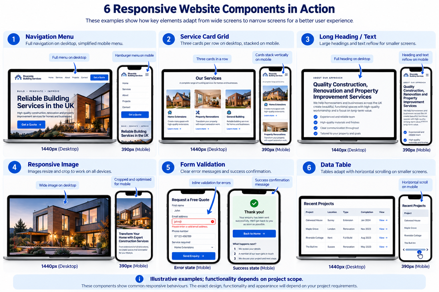
Responsive website development services can cover the components below where they are relevant to the agreed brief.
- Navigation: menu states, nested items, keyboard focus, close controls and mobile tap targets.
- Content grids: cards that reflow without losing meaningful reading order.
- Typography: headings and body copy that remain readable with longer text and browser zoom.
- Images and media: appropriate image sizing, cropping and layout behaviour.
- Forms: usable labels, validation messages, error recovery and confirmation states; server-side processing is a separate technical dependency.
- Tables: deliberate handling of wide data through scrolling or alternative presentation, without hiding important values.
- Reusable components: common patterns implemented consistently across agreed templates.
Responsive Design, Development or Both?
| Requirement | Design-led work | Development-led work | Combined project |
|---|---|---|---|
| Main objective | Define layouts and visual decisions | Implement working pages and interactions | Define and build the interface |
| Best starting point | Requirements without approved layouts | Approved designs or clear existing requirements | New site needing both disciplines |
| Interaction states | Specify how they should appear | Implement agreed behaviour | Specify and implement |
| CMS and functionality | May inform requirements | Develop if included in scope | Plan and develop if included |
| Testing | Review design decisions | Test implemented behaviour | Both design review and functional QA |
If you mainly need visual direction, explore our mobile website design service or responsive website design. This page focuses on the technical implementation of responsive interfaces. Responsive web design and development work together when a business needs both visual planning and technical delivery: design defines layouts and user experience, while development implements the agreed templates, navigation, forms and responsive components. A combined responsive website design and development brief can include both disciplines.
Where Responsive Development Makes a Practical Difference
Service Businesses Taking Enquiries
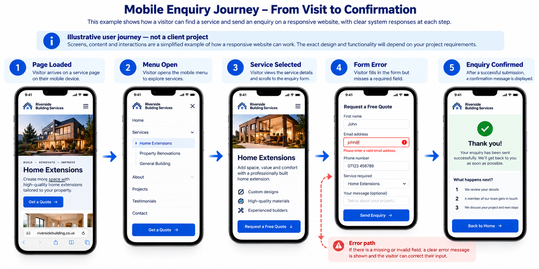
A visitor opens a service page on a phone, selects a service and completes an enquiry form. The website needs readable content, usable navigation and clear feedback if a required field is missing.
Online Shops with Complex Product Pages
A shopper compares product options, reviews images and moves towards checkout. Responsive work may cover product-page presentation and interface components, while payment, stock and checkout logic depend on the ecommerce platform and agreed scope.
Publishers and Content-Heavy Websites
An editor adds a longer headline or new article image. The responsive template should handle realistic content variation without causing overlap, clipped text or unexpected changes to reading order.
Teams with Finished Design Files
A marketing team has approved page layouts but needs them implemented. The developer must resolve intermediate screen widths, interactive states and CMS constraints that static design frames may not show.
Established Sites with Inconsistent Templates
A site owner finds that a particular table, menu or page template works on desktop but not on smaller screens. A scoped improvement may be preferable to a full rebuild, provided the underlying system supports it.
Practical Responsive Frontend Development Decisions
When CSS Grid or Flexbox Content Overflows
A three-column card grid may look correct with short placeholder text but overflow when a real service name wraps onto several lines. We check intrinsic sizing, content wrapping, spacing and reading order rather than forcing every heading into a fixed-height box. CSS Grid or Flexbox is selected according to the component, not because one technique is universally better.
When Container Queries Are More Useful Than Device Breakpoints
A reusable card might appear in a full-width page, a sidebar or a narrow CMS content region. A container query can respond to the space available to that component, while media queries can still handle page-level changes. The choice depends on browser support requirements and the project architecture.
When a Table Cannot Fit a Narrow Screen
We first identify which columns must remain visible. A labelled horizontal-scroll region may preserve the table’s relationships better than hiding important figures; for other datasets, an alternative stacked presentation may be appropriate. Any solution should retain meaningful headers and keyboard access.
How a Responsive Enquiry Journey Works
- Visitor opens a page: the layout adapts to the available viewport and content is presented in a usable order.
- Visitor navigates: a compact menu opens and closes with an accessible control.
- Visitor selects a service: the relevant page or content section appears without hiding essential information.
- Visitor submits an enquiry: required fields are checked and errors are shown beside the affected inputs.
- System responds: a success message appears after a confirmed submission, or the visitor is told how to correct a failure.
How the Responsive Website Is Structured
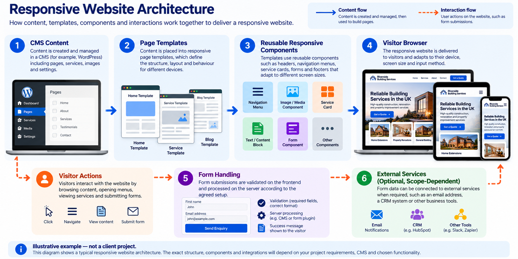
A typical content-managed implementation has several connected parts. Editors manage approved content in a CMS; templates organise that content; responsive components determine how it is presented at different widths; and browser interactions handle menus, forms and other user actions. External services, such as form delivery or analytics, sit outside this core flow and need their own requirements.
Technology Choices Follow the Project
Semantic HTML supports meaningful page structure; CSS Grid, Flexbox and media or container queries can control responsive layout; JavaScript may support interactive states; and responsive image attributes can help browsers select suitable image resources. The appropriate implementation depends on the existing platform, design and maintenance needs, rather than a fixed technology list.
CMS, Forms and Third-Party Integrations
WordPress is one possible CMS context; our responsive WordPress web design service covers platform-specific presentation needs. Ecommerce platforms, CRM-connected forms, analytics tools and embedded widgets may also affect responsive behaviour. Any specific integration, API work, consent configuration or server-side form processing should be identified and priced during scoping.
How We Decide What Should Adapt
Breakpoints are useful, but they should not be chosen solely because a device is called a phone or tablet. We consider the content and interaction first: at what width does the navigation become crowded, when does a grid stop being readable, and whether a table needs a different presentation. We also look at the range of content that editors may publish, not only the neat sample used in a design file.
Responsive appearance is not the same as responsive functionality. A page can fit a narrow screen while still having an unusable menu, a hidden form error or a checkout control that cannot be reached. The development scope should define which behaviours and states will be tested, not only which screen widths will be shown.
Responsive Behaviour Across Desktop, Tablet and Mobile
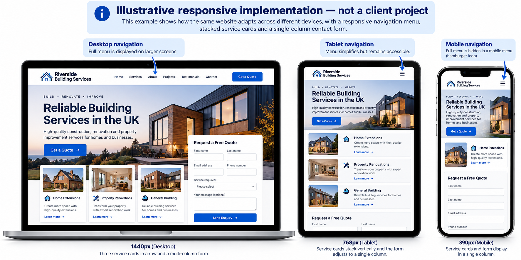
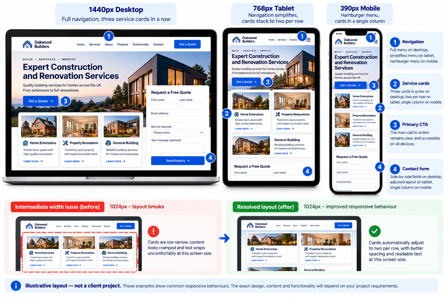
For a fictional service page, a three-column desktop grid might become two columns at an intermediate width and one column on a narrow screen. A desktop navigation bar may become a labelled menu control. A multi-column form may become a single-column form while retaining its labels and validation messages. These are examples of decisions, not fixed rules for every website.
Quality Assurance Before Handover
Testing should reflect the actual components and agreed acceptance criteria. Our website performance optimisation service can address broader performance work outside the responsive implementation scope. It may include viewport and browser checks, keyboard navigation, focus visibility, touch target usability, content overflow, forms and error messages, image presentation and basic performance review. Accessibility testing can identify issues, but it does not automatically establish WCAG conformance. Similarly, responsive implementation alone does not guarantee a particular Core Web Vitals score or search ranking.
Responsive Development Acceptance Checklist
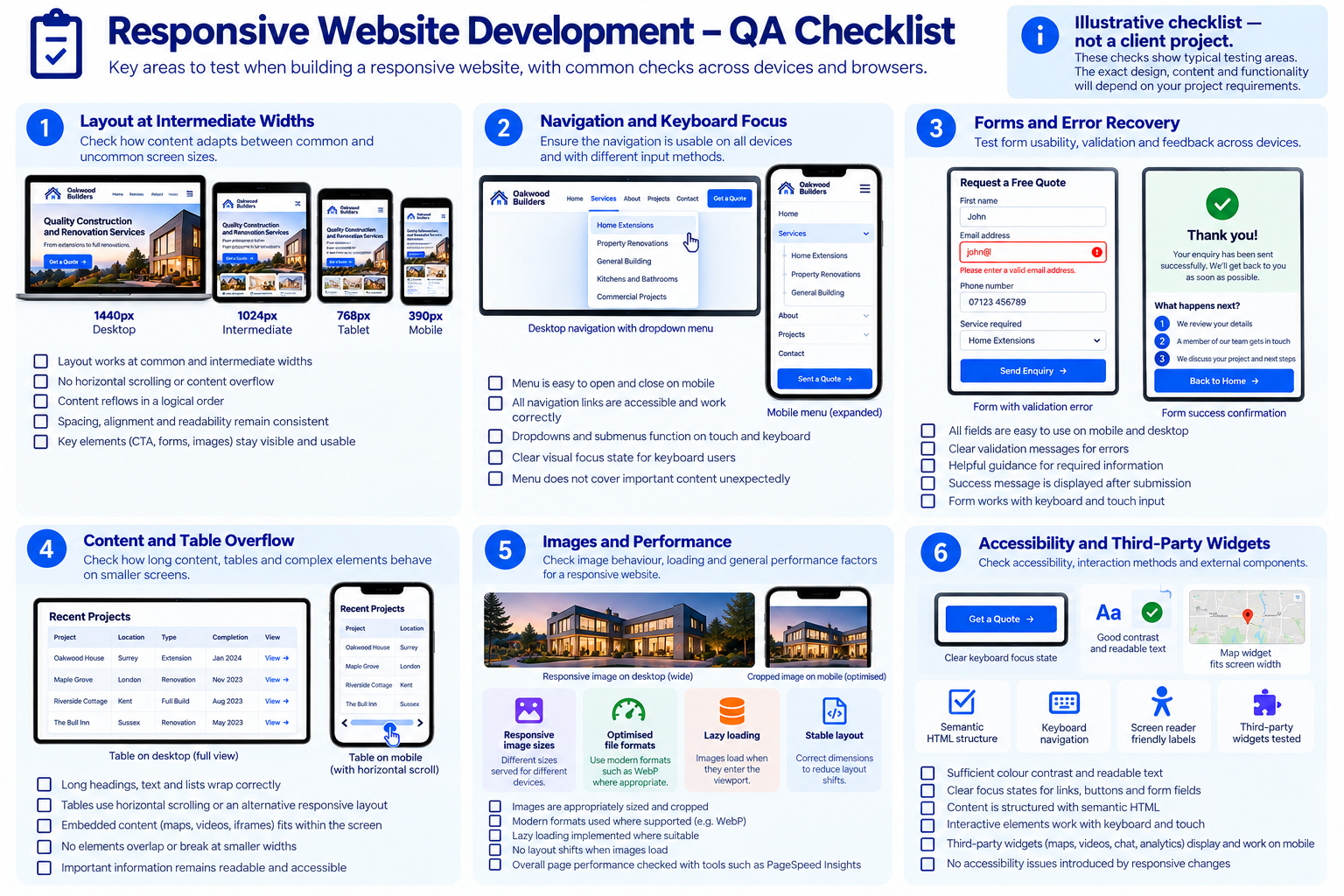
Before sign-off, we recommend reviewing representative templates and the most important user journeys against a practical checklist. The exact browser and device matrix is agreed for each project.
| Check | Example acceptance criterion | Why it matters |
|---|---|---|
| Intermediate widths | Menus, cards and headings remain usable between supplied design breakpoints. | Prevents layouts that only work in selected mockups. |
| Keyboard and focus | Interactive controls can be reached in a logical order with a visible focus indicator. | Supports accessible navigation. |
| Zoom and long content | Essential content and controls remain available when text is enlarged or headings wrap. | Reduces clipping and horizontal overflow. |
| Forms and validation | Labels, errors, recovery instructions and success states are clear on narrow screens. | Helps visitors complete enquiries. |
| Images and embedded content | Media scales appropriately without obscuring text or controls. | Protects readability and layout stability. |
| Performance review | Relevant templates are checked for avoidable image, script and layout issues. | Identifies performance risks without promising a fixed score. |
For accessibility guidance, see the W3C Web Content Accessibility Guidelines. For field-based performance measures, consult Google’s Core Web Vitals documentation. These resources inform checks; passing a limited test does not establish full compliance.
Review Relevant Website Work
Explore our website portfolio to see examples of page presentation, navigation and content organisation across different business contexts. The examples below illustrate the types of interfaces worth assessing when commissioning responsive development; they are not presented as measured performance case studies.
Audit Consulting Group
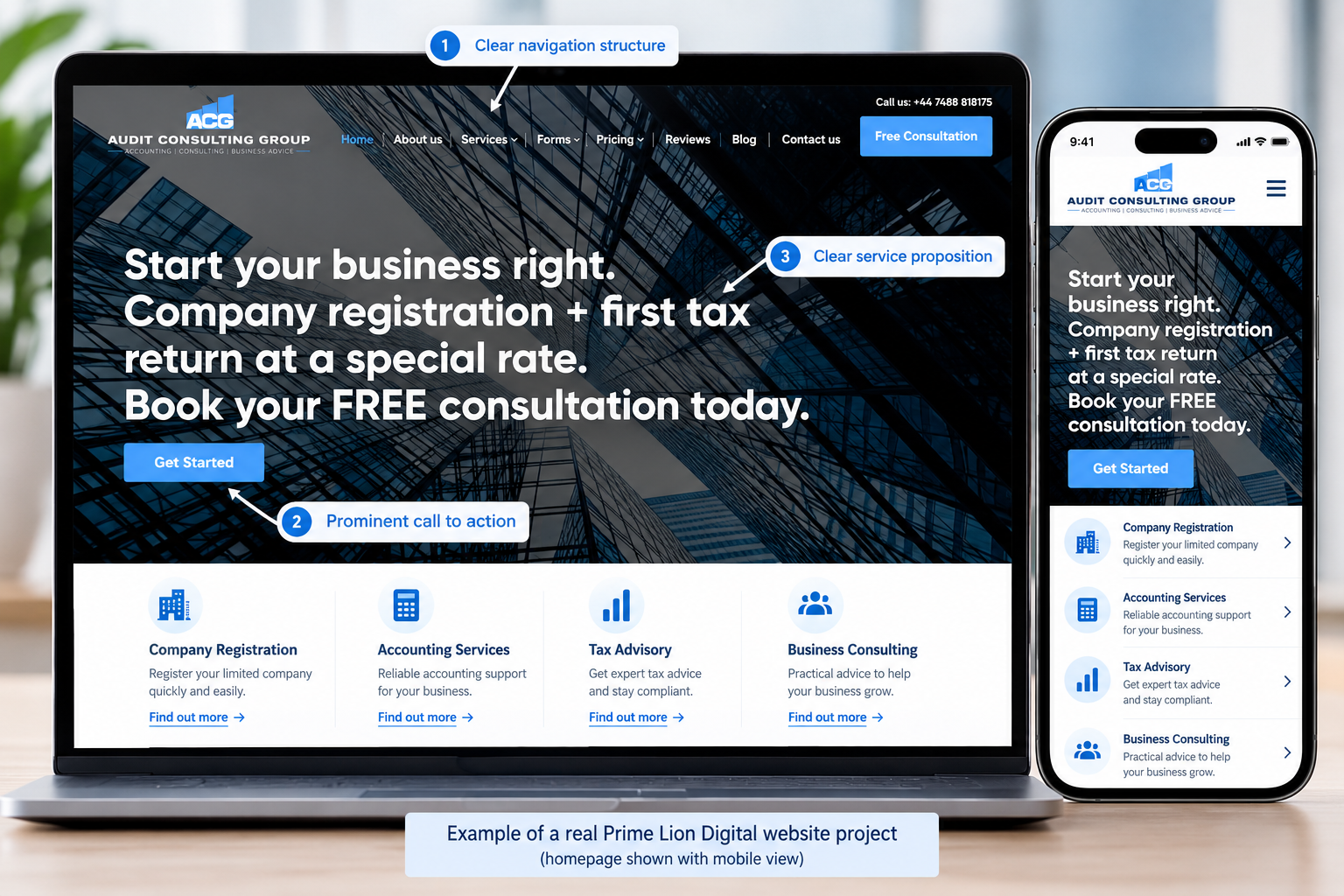
The Audit Consulting Group website is a professional-services example with multiple service topics and enquiry-focused content. When assessing this type of site, look at how service navigation, text-heavy pages and contact routes behave at narrow and intermediate widths. No unverified performance or conversion results are attributed to this example.
Construction & Repair Work
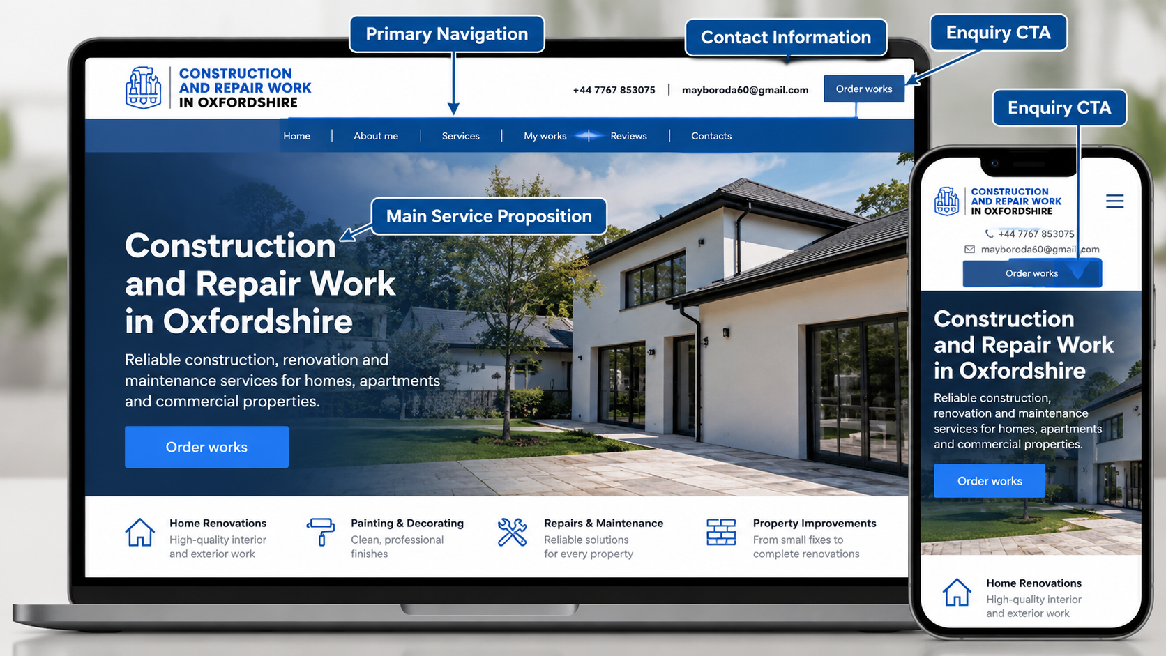
This UK service-business example illustrates the importance of clear service information and straightforward contact routes. For similar projects, we would assess mobile navigation, service-card stacking, tap targets and form behaviour as part of an agreed responsive-development brief.
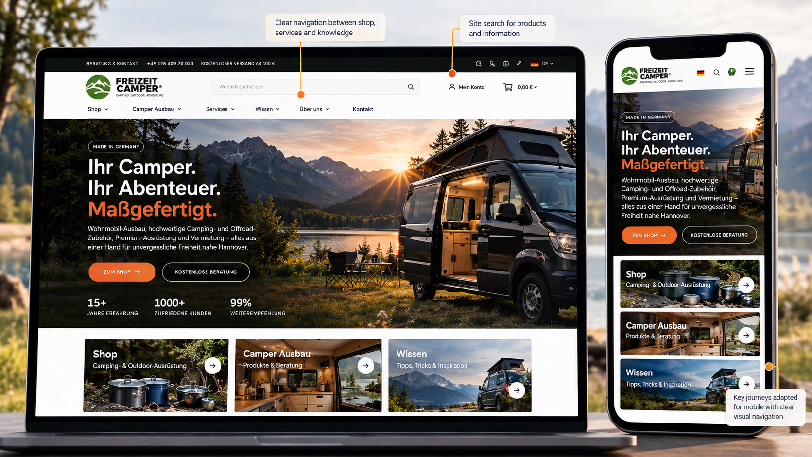
Freizeit Camper
Freizeit Camper provides a further visual reference for website structure and presentation. For a comparable responsive project, the brief would identify content density, navigation behaviour and how images and page components adapt; no unverified platform features or performance outcomes are claimed here.
Targeted Implementation or a Broader Responsive Build?
A smaller first phase may be appropriate when one important template or user journey needs attention. A broader implementation makes more sense when navigation, design patterns, CMS templates and interactions are inconsistent across much of the site. The smaller option should still meet agreed quality standards; it simply covers fewer requirements.
Discuss Your Website or Development Brief
Responsive Fixes or a Full Website Redesign?
Choose targeted responsive implementation when the underlying design and content architecture still work, but specific templates, menus or forms fail on smaller screens. Consider a broader website redesign when navigation, information hierarchy, brand presentation and page patterns need reconsideration across the site. We can help define which route is proportionate to the problem rather than assuming every issue requires a rebuild.
Our Responsive Development Process
- Requirements and materials: PLD reviews the website, design files, platform and desired user journeys. The client provides access and confirms priorities.
- Technical scope: we identify templates, components, dependencies, acceptance criteria and a quotation. The client approves the scope before implementation.
- Implementation: the agreed responsive layouts and interactions are developed within the selected platform.
- Quality checks: relevant widths, browsers, content variations and interactive states are reviewed; findings are addressed within the agreed scope.
- Client review: the client checks the agreed pages and raises feedback against the acceptance criteria.
- Deployment and handover: release, access, documentation and any further support are handled according to the project agreement.
What You Receive
| Deliverable | What it means | Inclusion |
|---|---|---|
| Agreed responsive pages or templates | Working implementations for the page types listed in the scope. | Core to the agreed build |
| Specified interactions | Navigation, forms or other components with agreed states. | Scope-dependent |
| CMS implementation | Configured editable content where a CMS is part of the brief. | Scope-dependent |
| Quality review | Checks against agreed acceptance criteria and supported environments. | Agreed testing scope |
| Deployment and handover | Release arrangements, access and documentation as contracted. | Agreement-dependent |
| Ongoing maintenance | Further changes, monitoring or support after launch. | Optional separate scope |
Responsive Website Development Cost — From £800
Responsive website development starts from £800. This is a minimum starting price, not a fixed quote for every website or a promise that all listed features are included. We provide a quotation after reviewing what needs to be built or changed.
| Cost factor | Why it matters |
|---|---|
| Number and complexity of templates | More distinct layouts and states require additional implementation and testing. |
| Existing platform and code | Legacy themes, plugins or third-party widgets may limit the available approach. |
| Interaction complexity | Forms, menus, filters and other controls may require additional states or backend work. |
| CMS and integration needs | Content modelling, APIs and external services need their own scope. |
| Testing and release requirements | Supported browsers, environments, accessibility expectations and deployment arrangements affect effort. |
What does “from £800” include? It indicates the starting level for responsive development work, not a predefined unlimited package. The quotation should specify the pages, components, integrations, testing, revisions and handover included. VAT treatment, hosting and any third-party charges must be confirmed before acceptance.
Example of a Smaller Responsive Development Brief
A limited project might involve adapting one existing service-page template and its navigation or form presentation for smaller viewports, followed by agreed checks. This is an illustration of how a narrowly scoped brief can be defined, not a promise that these tasks are all included for £800. The actual price depends on the existing code, complexity, access, testing requirements and any third-party dependencies. New multi-page websites and custom integrations generally require a broader quotation.
How Long Does Responsive Website Development Take?
Timing depends on design readiness, the number of unique templates, the condition of existing code, CMS or integration requirements, feedback and approval stages. A targeted component change may require a different schedule from a new multi-template website. We can discuss an estimated timetable after reviewing the brief; no fixed delivery period is implied by the starting price.
Expert Insight: Test Where the Layout Starts to Fail
One of the most useful responsive development decisions is to test the width at which a component stops working, rather than relying only on standard device presets. A navigation bar may fit at 1440px and collapse neatly at 390px, yet overlap the enquiry button at an intermediate width. Similarly, a card layout can look balanced with short sample headings but fail when an editor publishes longer real content.
For that reason, PLD recommends defining component behaviour and testing realistic content before the final review. Ask whether the menu still works with a longer item, whether a table remains understandable when it cannot fit, and whether a form displays validation errors without obscuring the next action. These checks help turn an attractive set of responsive layouts into a website that visitors can actually use. The exact test matrix should reflect the project’s agreed scope and supported environments.
Related Website Services
For visual planning, see Mobile Website Design and Responsive Website Design. For implementation beyond page layouts, explore Web Development Services. If the issue is a broader site fault, see Website Help & Solutions. For storefront requirements, visit Ecommerce Website Design.
Frequently Asked Questions
What is responsive website development?
It is the implementation of website layouts and interactions that adapt to different screen sizes and available widths, so visitors can use the site across devices.
How much does responsive website development cost?
PLD projects start from £800. The final quotation depends on templates, components, existing code, integrations and testing requirements.
Can you make my existing website responsive?
Potentially. We first need to review the website, its platform and the components causing problems to determine whether targeted changes or a wider rebuild would be more appropriate.
Can you develop a website from approved Figma designs?
Yes, this is a potential project route. The design handoff should also cover responsive states, interactions and content variations; the exact deliverables are agreed in the quote.
Is responsive website development the same as mobile website design?
No. Mobile website design focuses primarily on interface planning and visual decisions, while responsive development implements working layouts, components and interactions. Some projects require both.
Can a WordPress website be responsive?
Yes. The practical approach depends on the theme, page builder, plugins, custom code and whether the required templates can be changed safely.
Will a responsive website improve Google rankings?
Responsive implementation can support mobile usability, but it does not guarantee rankings or traffic. Search performance also depends on content, technical SEO, competition and other factors.
Do you test mobile, tablet and desktop layouts?
Testing can cover agreed viewport ranges, browsers, content variations and interaction states. The supported environments and acceptance criteria should be defined in the project scope.
Who owns the finished website and code?
Ownership, licences, third-party dependencies and access arrangements should be confirmed in the project agreement. Do not assume every external plugin or licensed asset can be transferred without restrictions.
How long will my project take?
We can estimate timing after reviewing the scope, existing platform, design readiness and feedback requirements. There is no universal delivery period.
Can PLD help after launch?
Post-launch fixes, ongoing support and future development can be discussed separately. The quotation should make clear what is included in the initial delivery.
Get a Quote for Your Responsive Website Development Project
Tell us whether you need a new responsive website, implementation from approved designs or improvements to an existing site. Include your website URL if available, preferred CMS, design files, approximate number of page templates and the interactions that matter most. PLD can then discuss the practical scope, dependencies and a quotation starting from £800.
Ready to discuss your project? Send PLD your website URL or approved design files, the templates or components involved, and the outcome you need. Use the enquiry form on this page where available, or visit Prime Lion Digital to find our contact options.