
Tell us a little about what you’re looking for, and our team will be in touch to discuss how we can help.
Mobile Website Design Services in the UK – From £500
Your customers should be able to understand your services, find important information and contact your business without struggling with a small screen. Our mobile website design service focuses on making those everyday actions straightforward, with clear layouts, readable content, touch-friendly navigation and well-placed calls to action.
Prime Lion Digital is a UK mobile website design agency providing mobile-friendly website design services for new and existing business websites. We design around real smartphone tasks, including comparing services, finding information and submitting enquiries, rather than simply shrinking a desktop layout.
Mobile website design from £500. The final quotation depends on the pages, design requirements and any implementation work involved.
Request a Mobile Website Design Quote — Share your website URL, the main mobile problem and whether you need design only or design and implementation. We will review your requirements and explain the proposed scope before quoting.
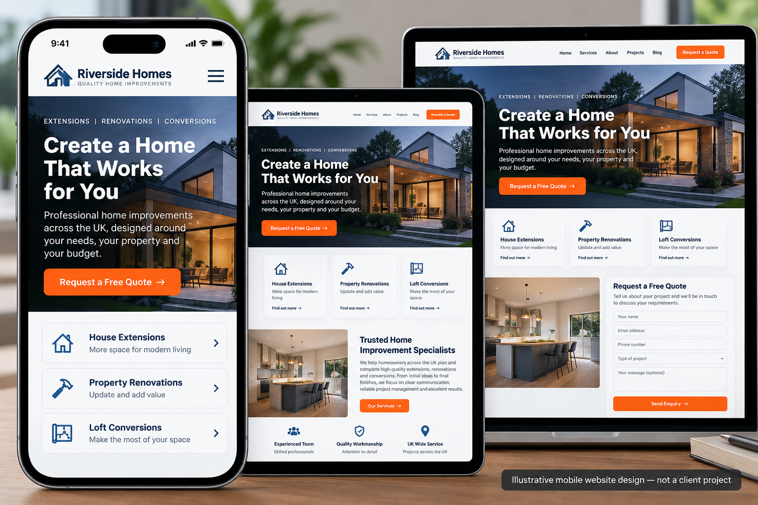
Mobile-Friendly Website Design Built Around Real User Needs
A visitor using a smartphone may be looking for a phone number, comparing services, checking a price or trying to submit an enquiry. The design should make those actions easy to complete without unnecessary searching, zooming or repeated scrolling.
Good mobile friendly website design considers what visitors need first, how information is organised and which actions deserve the most attention. A layout can fit perfectly within a phone screen and still be frustrating if the menu is confusing, the text is difficult to read or the contact form requires too much effort.
Our mobile web design approach considers the relationship between your business goals and the tasks your visitors want to complete.
Designed for the Way Customers Use Smartphones
- Service businesses: Make services, coverage areas, contact details and enquiry options easy to find.
- Professional firms: Present expertise, credentials, service information and next steps clearly.
- Local businesses: Prioritise opening information, contact options, locations and booking routes where relevant.
- Online shops: Make product information, navigation and purchasing journeys easier to follow on smaller screens; more extensive store work is covered by our ecommerce website design service.
- Growing businesses: Establish mobile design patterns that can accommodate additional pages and services.
The right priorities depend on the website. A mobile design for a consultancy should not automatically follow the same layout decisions as an online shop or a restaurant booking website.
What Makes a Website Easy to Use on Mobile?
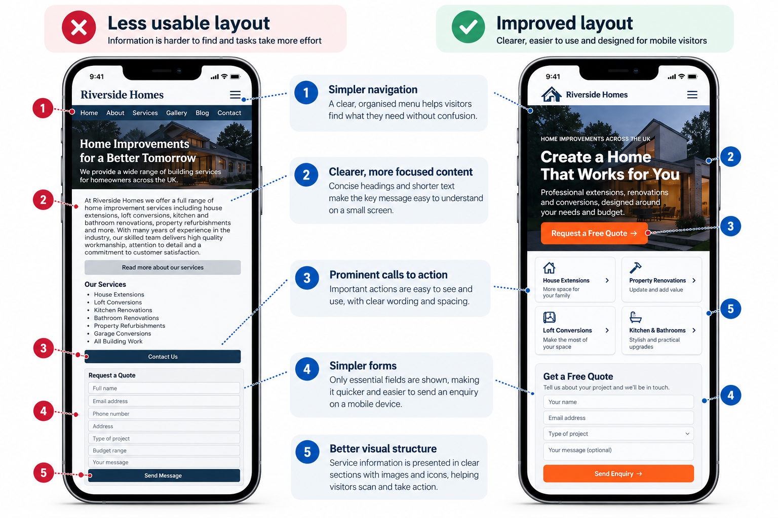
Effective mobile friendly web design makes information and important actions easier to access on smaller, touch-operated screens. The most useful improvements often concern content order, navigation clarity and the effort required to complete a task.
1. Clear Mobile Navigation
Visitors should understand where to go without opening several menus or guessing what a label means. We consider menu structure, page hierarchy, visible contact routes and how navigation behaves on narrow screens.
For a business with several services, a concise menu and well-organised service categories may be more useful than reproducing every desktop navigation item.
2. Touch-Friendly Buttons and Calls to Action
Buttons and links need sufficient space to be used comfortably with a finger. Important actions should be identifiable through their wording, position and visual treatment.
A clear “Request a Quote” button may be appropriate for a service business, while an ecommerce website may need to prioritise product selection and checkout. The primary action should reflect what the visitor is trying to achieve.
3. Readable Typography and Content Hierarchy
Text should remain readable without pinch-to-zoom. Headings need to explain the page, paragraphs should be manageable and important information should appear before less essential details.
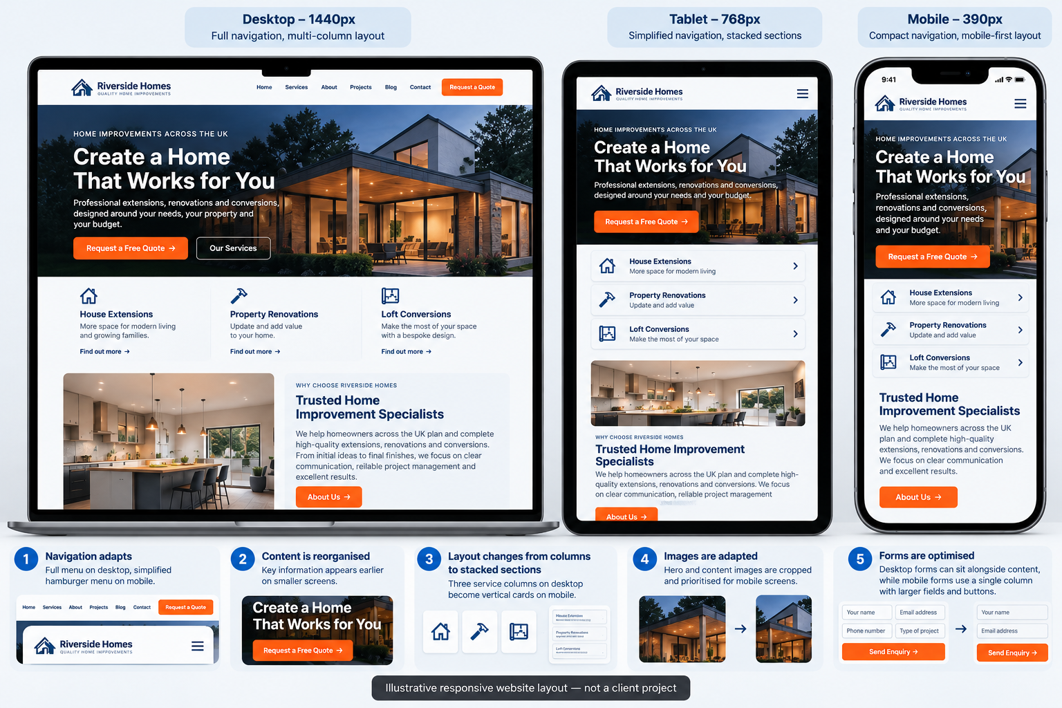
We consider line length, spacing, heading hierarchy and the presentation of longer content. Desktop columns may become stacked blocks on mobile, but the order should still make sense.
4. Mobile-Friendly Forms
Long or confusing forms can make a straightforward enquiry unnecessarily difficult. We consider field order, labels, input types, error messages and the information a business genuinely needs to collect.
Where appropriate, forms can be organised to reduce unnecessary typing and help users understand what happens after submission.
5. Flexible Images and Content Layouts
Large photographs, comparison tables, pricing information and promotional sections need particular attention on mobile. Important content should not disappear because it is difficult to fit into a narrow layout.
We consider how images are cropped, how content blocks are reordered and how more complex information can remain understandable across different screen widths.
6. Accessibility and Mobile Usability
Colour contrast, visible focus indicators, understandable labels, appropriate spacing and predictable interactions all contribute to a more usable interface.
Accessibility requirements should be considered during design and reviewed during implementation. A visually accessible concept alone does not establish that the finished website meets a particular accessibility standard.
Mobile Website Design Quality Checks
A strong mobile design should be assessed against real tasks, not just whether it looks attractive in a phone mock-up. We use the following checks to inform design decisions; the exact technical testing and implementation work depends on the agreed project scope.
Navigation, Touch Targets and Accessibility
We review whether visitors can identify the next step, operate controls without accidental taps and understand form errors. Relevant design considerations include the WCAG 2.2 target-size criteria, visible keyboard focus, meaningful labels and readable contrast. A design review is not a certification of WCAG compliance; the finished implementation must also be tested.
Content Order and Small-Screen Layout
We check that important information remains available on mobile, that text and tables do not create avoidable horizontal scrolling and that rearranged columns preserve a logical reading order. We assess layouts at representative narrow, medium and wide viewport widths, rather than assuming that one smartphone screenshot covers all devices.
Images, Performance and Implementation Handover
Design choices can affect image size, layout stability and loading experience. We consider image cropping, space reserved for visual elements and how prominent content might influence Largest Contentful Paint (LCP) or Cumulative Layout Shift (CLS). Actual Core Web Vitals depend on the implemented website and require measurement, not design-only promises. For implementation support, see our website performance optimisation service.
Forms and Enquiry Journey Checks
For a service enquiry, a practical review might ask whether the main call to action is visible, whether input labels are understandable, whether mobile keyboards suit the field types and whether confirmation messages make the next step clear. We avoid adding fields unless they are necessary for the initial enquiry.
Mobile-First Design vs Responsive Web Design
Mobile-first and responsive design are closely related, but they describe different aspects of the design process.
Mobile-first design starts by considering the needs and limitations of smaller screens. Content priorities, navigation and important interactions are established for mobile before the experience is expanded to larger layouts.
Responsive web design allows a website’s layout to adapt to different screen sizes. Elements may resize, move, stack or change their presentation according to the available space.
Mobile responsive website design can combine both approaches: establishing a useful smartphone experience while creating layouts that adapt appropriately to tablets, laptops and desktop computers.
How the Approaches Compare
| Approach | Main consideration | Best application |
|---|---|---|
| Mobile-friendly design | Usability on smartphones | Improving navigation, content and mobile interactions |
| Responsive design | Layouts adapting across screen widths | Creating consistent experiences across devices |
| Mobile-first design | Designing around smaller screens initially | Projects where mobile journeys are a central priority |
For many businesses, mobile first responsive web design is a practical approach because it encourages early decisions about content priority while allowing the layout to expand for larger screens.
However, the choice should reflect the project. An existing desktop website may benefit from focused mobile improvements without requiring every page to be redesigned from the beginning.
Our mobile responsive web design work concentrates on how the finished experience should look and behave. Detailed frontend implementation and technical responsive development can be included where agreed or handled as a related development service.
What Our Mobile Web Design Service Includes
The scope of a mobile website design project depends on whether we are creating new page layouts or improving an existing website. We agree the relevant design work and deliverables before the project begins.
Mobile UX and Content Planning
We identify the main tasks visitors need to complete and consider how navigation, page structure and content order should support those tasks.
Mobile Page Layout Design
We plan the presentation of agreed page types, including headings, service information, images, content sections, calls to action and relevant trust elements.
Navigation and Interaction Design
We consider how menus, buttons, expandable content and other agreed interface elements should behave on smaller screens. Projects requiring broader research and interface systems may also benefit from UI/UX design.
Mobile Enquiry and Conversion Paths
Where relevant, we design the route towards contacting the business, requesting a quote, booking an appointment or completing another important action.
Responsive Design Considerations
We consider how agreed layouts should adapt between mobile and larger screens, including content stacking, spacing and the presentation of images or forms.
Design Review and Handover
Depending on the project, the agreed deliverables may include mobile page designs, responsive layout guidance, design specifications and review notes for implementation.
Additional Services Available Where Required
- Frontend responsive implementation.
- WordPress design and development changes.
- Additional page templates or complex interactive elements.
- Ecommerce and checkout interface design.
- Website performance optimisation.
- Copywriting and content restructuring.
- Analytics and conversion tracking configuration.
- Broader website redesign or redevelopment.
These activities are not automatically included in the £500 starting price. Your quotation will distinguish the agreed core design work from additional development or specialist services.
Mobile Website Design Examples: From Desktop to Smartphone
One of the most important design decisions is deciding what a visitor sees first. Desktop layouts provide room for navigation, multiple columns and supporting information. On a smartphone, those elements compete for a much smaller visible area.
Consider a fictional accounting-services website. A desktop page might display service categories, credentials, contact information and a quotation form in several columns. On mobile, a more useful sequence could be:
- A clear explanation of the service.
- A visible enquiry or consultation action.
- Key service details and eligibility information.
- Relevant credentials or trust evidence.
- Additional information and frequently asked questions.
- A contact form when the visitor is ready to enquire.
This is an illustrative structure, not a universal template. The correct order depends on the audience, the complexity of the service and the questions visitors need answered.
Designing the Mobile Journey to Enquiry
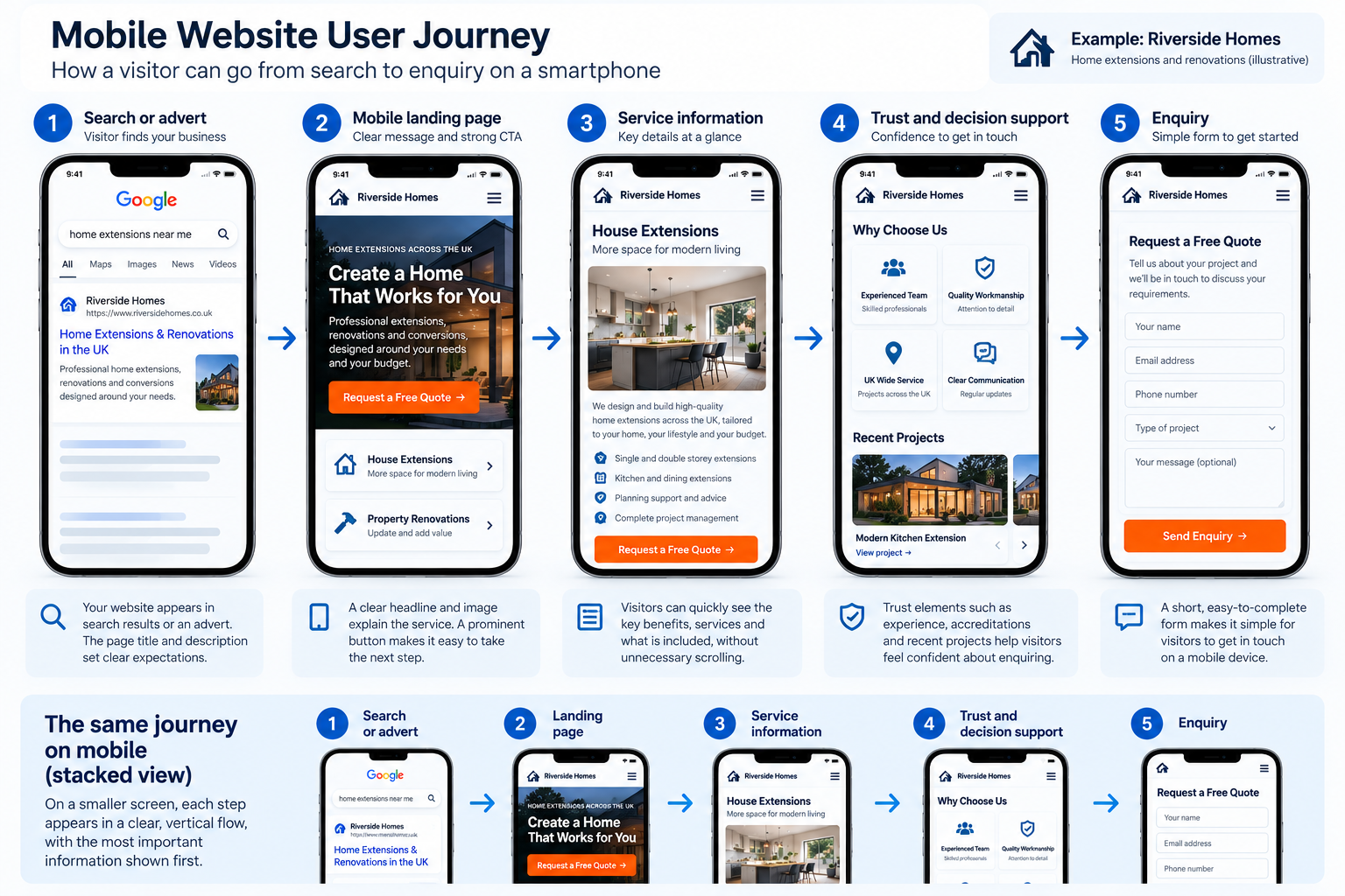
For an enquiry-led website, the journey should help visitors understand the offer, establish whether it is relevant and find a suitable contact option.
Some visitors may be ready to enquire immediately. Others need pricing information, service details or reassurance before making contact. The mobile layout should support both behaviours without forcing everyone through the same long sequence.
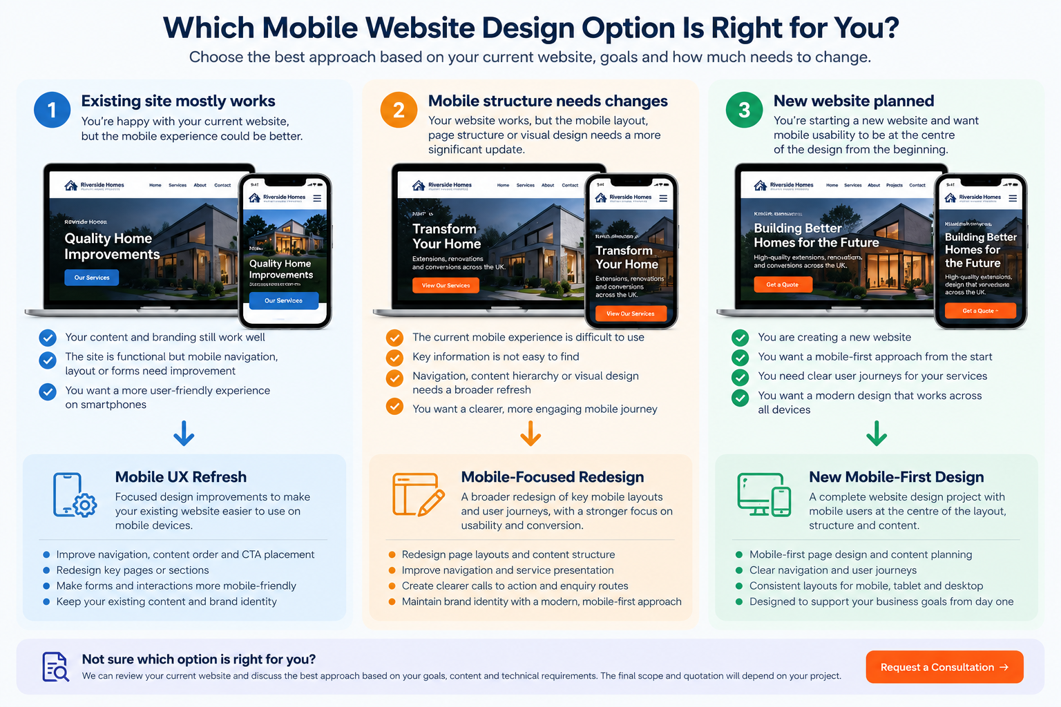
Which Mobile Website Design Option Is Right for You?
Not every website needs a complete redesign. The appropriate approach depends on what already works, how much of the mobile experience needs changing and whether the existing website can support those changes.
| Option | When it may suit you | Typical design focus |
|---|---|---|
| Mobile UX Refresh | Your website is functional, but selected mobile pages or interactions are awkward. | Navigation, spacing, CTA placement, typography and forms. |
| Mobile-Focused Redesign | The mobile experience needs broader changes to page structure or visual presentation. | Page hierarchy, content organisation, navigation and new layouts. |
| New Mobile-First Website Design | You are planning a new website and want mobile usability considered from the outset. | Mobile user journeys, design concepts and responsive layout planning. |
These are project approaches rather than fixed-price packages. We can help identify the most appropriate scope after reviewing your requirements.
Do You Need a New Website or Better Mobile Design?
If your existing website already has suitable content, a working CMS and a usable desktop experience, targeted mobile design improvements may be sufficient. If the navigation, page structure and visual hierarchy are difficult to use across the site, a broader redesign may offer a more coherent solution.
Tell us what feels difficult on mobile, and we can discuss the appropriate design scope.
Mobile Website Design Examples and Portfolio
Examples of real website work can help you assess visual quality, content organisation and the way different page elements are presented. Our portfolio provides a starting point for reviewing Prime Lion Digital’s wider website and digital design work.
When reviewing a project for mobile design quality, consider how the layout handles navigation, text, images, service information and enquiry actions. A desktop screenshot alone cannot demonstrate the quality of the mobile experience.
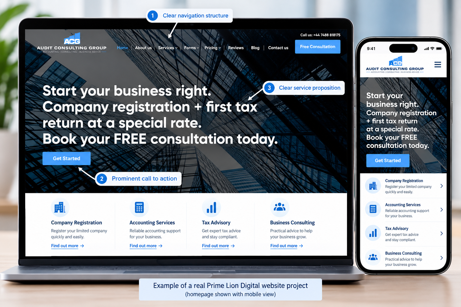
Audit Consulting Group — Professional Services Website
The Audit Consulting Group website demonstrates how a professional-services business can organise multiple services, present important information and guide visitors towards an enquiry. The project provides a useful example of clear content hierarchy, service navigation and consistent website design.
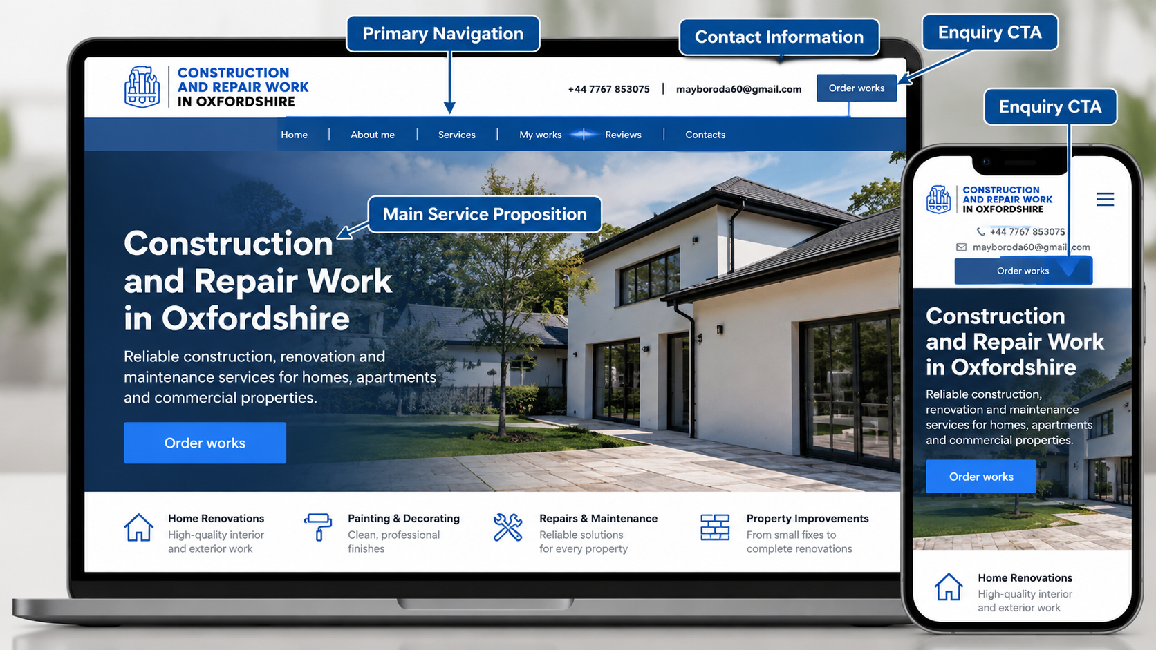
Construction & Repair Work — Local Services Website
This local-services website demonstrates how service information, calls to action and contact options can be presented within a clear, professional layout. Explore the project to see how the website design supports visitors looking for construction and repair services.
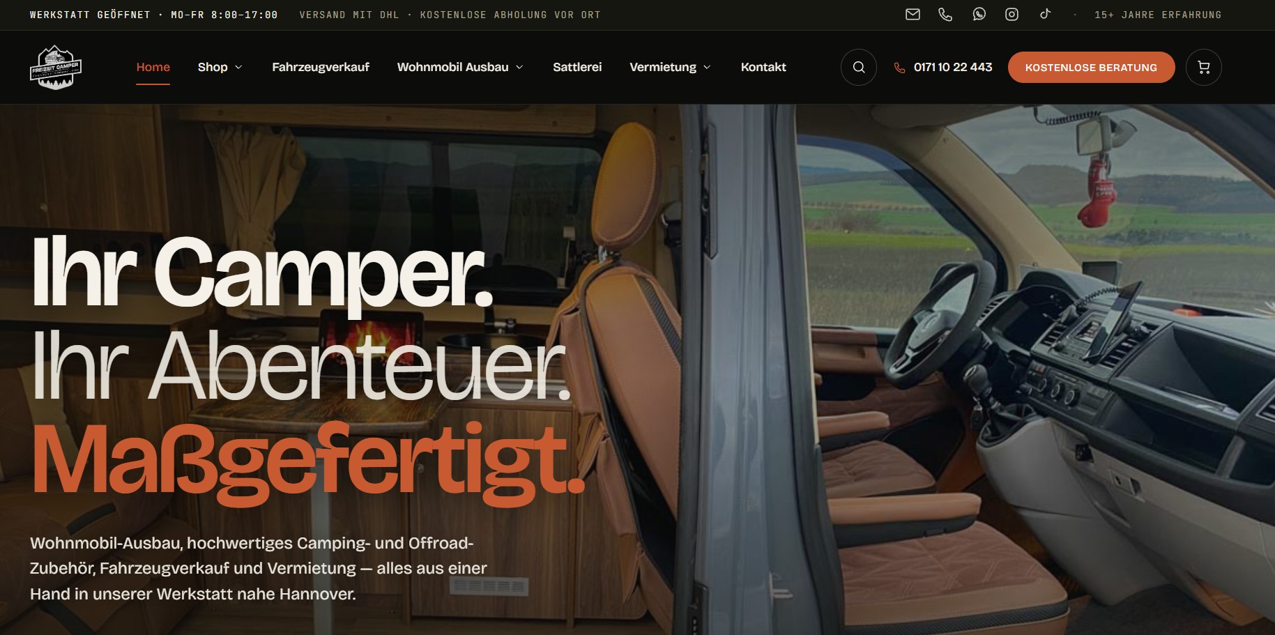
Freizeit Camper — Ecommerce Website
The Freizeit Camper project provides an example of ecommerce website design, where product presentation, navigation and content organisation are particularly important. Explore the project to see how visual elements and product information are brought together within an online shopping experience.
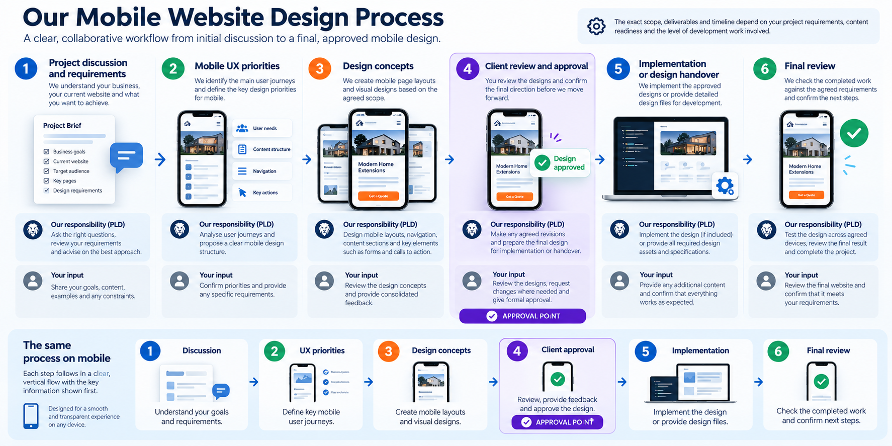
Our Mobile Website Design Process
A mobile design project works best when the main user journeys, design priorities and approval points are understood early. We structure the work around the requirements of the agreed project rather than applying the same set of layouts to every website.
1. Project Discussion and Requirements
We discuss your business, target audience, existing website where applicable and the actions visitors need to complete. You provide relevant content, examples, preferences and project constraints.
2. Mobile UX Priorities
We identify the most important mobile journeys and decide which pages, navigation elements and interactions require design attention. The proposed scope is reviewed before detailed work proceeds.
3. Layout and Design Concepts
We develop the agreed mobile design concepts, considering visual hierarchy, content order, typography, buttons and the presentation of key information.
4. Client Review and Approval
You review the proposed direction and provide consolidated feedback. Revisions are handled according to the agreed quotation and project scope.
5. Implementation or Design Handover
Depending on the agreement, approved designs may be prepared for development or implemented as part of the project. Any additional technical work is defined in the agreed scope.
6. Final Review
We review the agreed outputs against the project requirements and confirm the relevant handover or completion steps.
The project timeline depends on the number of unique layouts, content readiness, design complexity, feedback and any implementation requirements. We confirm the expected schedule when the scope is agreed.
Mobile Website Design Cost in the UK
Prime Lion Digital mobile website design starts from £500.
This is an entry-level starting price, not a fixed package. It does not automatically include a full website, a predetermined number of page templates, development, unlimited revisions or technical performance work. Before work begins, your written quotation will specify the exact pages or layouts, design outputs, review rounds, handover format and any separately priced implementation.
What Affects the Price?
- Number of unique layouts: A single mobile page design has different requirements from several distinct page templates.
- Existing website condition: Improving an established layout may require a different approach from designing a new website.
- Navigation complexity: Larger service structures or more complicated menus require additional design consideration.
- Forms and interactions: Multi-step forms, booking interfaces and ecommerce journeys can increase scope.
- Content readiness: Existing, approved content can simplify design decisions, while restructuring or rewriting content adds work.
- Responsive implementation: Design-only projects differ from projects requiring frontend or CMS development.
- Review and revision requirements: The number of agreed design concepts and feedback rounds influences the quotation.
What Will Your Mobile Website Design Quote Include?
Your proposal will describe the agreed pages or design elements, relevant deliverables, whether implementation is included, the review process and the expected project schedule.
We will also identify any optional work that falls outside the core quotation, so you can decide what is necessary before committing to a broader project.
Ask for a written quotation that clearly separates mobile design deliverables from development and optional work.
Expert Insight: Why a Responsive Website Can Still Be Difficult to Use on Mobile
One of the most common design misunderstandings is assuming that a website is mobile-friendly simply because its layout fits the screen. Responsive behaviour is important, but it does not automatically resolve problems with content priority, navigation or user interaction.
A website may display correctly on a smartphone while placing its most important information several screens down the page. A contact button might be visible but difficult to tap. A form may technically work while asking visitors to enter more information than is necessary for an initial enquiry.
These are design decisions, not merely questions of screen width. For example, a service enquiry page might replace an unclear “Learn More” action with a specific “Request a Quote” link, move the service summary above secondary content and reduce unnecessary form fields. These are illustrative improvements, not claims about a particular client project.
We recommend reviewing mobile pages around the tasks visitors are trying to complete. For a service business, that may mean understanding the offer, checking suitability and making contact. For an online shop, it may mean finding a product, reviewing details and progressing through checkout.
Good mobile design gives those tasks a clear place within the layout. Responsive development then needs to preserve that experience across the agreed devices and screen sizes.
Related Website Design and Development Services
Mobile-focused design can form part of a wider website project. If your requirements extend beyond layout and user experience, the following services may be relevant.
Website Design Services
For businesses requiring broader page design, visual direction and website structure rather than mobile-specific improvements.
Explore Website Design Services
Responsive Website Development
For implementing adaptive frontend layouts, responsive behaviour and technical functionality across devices.
Explore Frontend Development Services
Responsive WordPress Web Design
For WordPress websites requiring responsive theme, template or block-based design work.
Explore Responsive WordPress Web Design
Website Redesign
For projects requiring wider changes to existing website structure, presentation and user journeys.
Explore Website Redesign Services
You can also explore our wider website portfolio to review examples of completed digital work.
Frequently Asked Questions About Mobile Website Design
How much does mobile website design cost in the UK?
Prime Lion Digital offers mobile website design from £500. The final cost depends on the number of layouts, design complexity, existing website requirements and whether development work is included. We provide a quotation based on the agreed scope.
What is mobile-friendly website design?
Mobile-friendly website design focuses on making a website comfortable to use on smartphones. It includes readable content, practical navigation, suitable button sizes, well-organised layouts and accessible routes to important actions such as contacting a business or making a purchase.
What is the difference between mobile-first and responsive web design?
Mobile-first design begins with the needs of smaller screens, while responsive design allows layouts to adapt to different screen widths. The approaches can be used together. A mobile-first design can also be responsive across tablets and desktop devices.
Can you make my existing website mobile-friendly?
Yes, depending on the current website and the changes required. Some sites benefit from improvements to selected mobile layouts, while others need broader redesign or development work. We can discuss the appropriate scope after reviewing your website.
Will my website work on iPhones, Android phones and tablets?
Responsive layouts can be designed to accommodate a range of devices and screen sizes. The exact browsers, devices and testing requirements should be agreed as part of the project. No single design review can guarantee identical behaviour on every possible device.
Does mobile website design help SEO?
Mobile-friendly design supports usability and can help create a better experience for visitors arriving from search. Google uses the mobile version of a site’s content for indexing, so important information should remain accessible on mobile. However, design improvements alone do not guarantee higher rankings or additional traffic.
How long does a mobile website design project take?
Timing depends on the number of layouts, complexity of the design, availability of content, client feedback and any development requirements. We confirm an expected schedule once the project scope has been established.
What is included in the £500 starting price?
The £500 figure is a starting price for a defined mobile website design project, not a universal package covering every requirement. Your quotation will identify the included design work, deliverables, review arrangements and any separately priced implementation.
Do I need a new website or mobile design improvements?
If your existing website has a suitable structure and functioning technology, focused mobile UX improvements may be enough. If the overall navigation, content hierarchy or visual design needs substantial changes, a broader redesign may be more appropriate.
Can you develop the mobile design in WordPress?
Prime Lion Digital also offers WordPress-related website design and development services. WordPress implementation can be discussed alongside the mobile design work and included in the agreed quotation where required. Learn more about WordPress web design.
Let’s Make Your Website Easier to Use on Mobile
If visitors struggle to navigate your website, find the right information or complete an enquiry on their phones, we can help you plan a clearer mobile experience.
Tell us whether you need a new mobile-first design, improvements to an existing website or a broader responsive redesign. We will discuss your priorities and the work required.
To help us understand your project, please include:
- Your current website URL, if you have one.
- The main purpose of the website.
- What visitors should be able to do on mobile.
- Any pages or features you want to improve.
- Whether you need design only or design and implementation.
Mobile website design from £500.
Request Your Mobile Website Design Quote — Share your requirements with Prime Lion Digital and take the next step towards a more usable mobile website.