

SaaS Website Design: How to Explain Complex Products Clearly
Many SaaS websites do not have a product problem. They have an explanation problem.
That sounds obvious, but it is usually where commercial friction begins. The team knows the platform inside out. Investors understand the category. Product and engineering talk in shorthand. Sales can explain the value on a call. Yet the website — the place where first impressions are formed and shortlists are made — often asks a cold visitor to do too much interpretation.
That is where good SaaS website design becomes more than aesthetics. It becomes translation. Not simplification for its own sake, but clear communication of a complex product without flattening what makes it valuable.
Leave your details and our team will get back to you shortly to discuss your website, SEO or digital growth project.
For SaaS and tech firms in the UK, especially in B2B, this matters more than many teams initially expect. Buyers arrive with partial context, multiple stakeholders and limited patience. If the site makes the product feel confusing, abstract or oddly hard to picture, the commercial impact appears quickly: weaker demo intent, lower-quality enquiries, more objections, slower internal buy-in and a growing dependence on sales calls to explain what the website should have made obvious earlier.
Why clarity is now a competitive advantage
There was a period when many SaaS brands could get away with broad promises, soft gradients, generic UI mock-ups and a headline about “transforming workflows”. In crowded categories, that no longer carries much weight. Buyers have seen the pattern too many times.
What has changed is not simply design taste. It is the maturity of the market. Prospects compare faster, scrutinise harder and involve more people in the decision. A finance lead, operations manager, technical evaluator and commercial decision-maker may all look at the same site for different reasons. Each one is trying to answer a slightly different question. What exactly is this? How does it fit our workflow? Is it credible? Is switching realistic? Why this rather than the dozen near-adjacent tools already in the tab bar?
In that environment, clear SaaS web design is not just a branding exercise. It reduces cognitive load at the exact moment a buyer is deciding whether your product is worth understanding in more depth.
The real issue is rarely “too much complexity”
Teams often say their platform is difficult to explain because it is technically sophisticated, heavily integrated or built for a nuanced operational process. Sometimes that is true. More often, the deeper issue is that the website is communicating from the inside out.
The navigation mirrors the org chart. The homepage reflects internal terminology. Features are grouped by product team rather than buyer outcome. Screenshots appear before the visitor understands what they are looking at. Messaging assumes category knowledge that many qualified buyers do not yet have.
Complexity itself is not the enemy. Unstructured complexity is.
A procurement platform, compliance workflow system, AI analytics product or vertical SaaS tool can absolutely be explained clearly. But the explanation has to follow the buyer’s mental sequence rather than the company’s internal sequence. That distinction sounds small. It is not.
What strong SaaS product communication usually does differently
The best SaaS websites tend to do a few things at once. They make the product legible, they frame the business problem properly, and they help different stakeholders find their own route into the story. That is one reason websites for SaaS and tech companies often need a different communication model from more conventional brochure-style sites.
Most importantly, they do not confuse explanation with compression. A clearer website is not necessarily a shorter one. It is one that puts the right information in the right order.
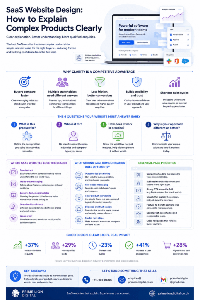
That often means answering four questions early:
- What is this product actually for?
- Who is it for?
- How does it work in practice?
- Why is its approach different or more useful than the alternatives?
If any of those remain fuzzy after the first scroll or two, the site is already creating unnecessary drag.
Where SaaS websites commonly lose the reader
There are some recurring failure patterns in SaaS UX and messaging, particularly in product-led and venture-backed environments where speed of launch beats editorial discipline.
One is abstraction. The homepage talks about acceleration, transformation, orchestration or visibility without grounding those ideas in a real task, user role or workflow. The language may sound polished, but the visitor cannot picture the product in use.
Another is feature dumping. In an effort to prove depth, the site lists modules, integrations, dashboards, permissions, automations and analytics panels in quick succession. Everything may be true, but the narrative never stabilises. The result is not credibility. It is blur.
Then there is screenshot dependence. Product teams often assume the interface will explain itself. It usually does not. A screen capture without framing text is like dropping a stranger into the middle of a film and expecting emotional investment within ten seconds.
And then there is terminology drift, which is more common than it sounds. A platform may be described as workflow software in one section, operations intelligence in another, an automation layer elsewhere and a decision platform on a solution page. Individually, each label may be defensible. Together, they create uncertainty.
The homepage is doing several jobs at once
One reason SaaS website design gets difficult is that the homepage is rarely speaking to a single reader. It is serving first-time visitors, warm leads, internal champions, procurement stakeholders, technical evaluators, and sometimes journalists or potential hires. Trying to serve all of them with one flat narrative usually produces vague messaging.
Better sites handle this by setting a clear top-level story while creating sensible paths for different depths of intent.
The opening section should not attempt to explain everything. It should establish orientation. What problem space are we in? What sort of platform is this? Who benefits? What kind of operational change does it enable?
After that, the site can layer detail. Not all visitors need architecture depth on the homepage. Not all of them need industry use cases immediately either. But they do need confidence that the rest of the explanation will be coherent if they continue.
Clarity starts with category positioning, not clever copy
Many teams jump too quickly into rewriting headlines when the underlying category position is still unresolved. If the business cannot state plainly what type of product it is and where it sits in the stack, design alone will not rescue the page.
This is especially important for SaaS products that span categories or create their own. Founders often resist simple labels because the product has outgrown them. Fair enough. But a website still needs an accessible point of entry. Buyers can handle nuance after orientation. They struggle when nuance comes first.
In practice, this means the website often needs a working category statement even if the company’s internal view is more ambitious. Not a reductive label, but a practical one. Something that helps the market place the product before it asks them to appreciate its differences. This is particularly common in early-stage firms, where startup website design work often has to compensate for positioning that is still evolving.
That is a subtle but important principle in SaaS website strategy: first make the product placeable, then make it distinctive.
How to explain a complex SaaS product without oversimplifying it
This is where good design, information architecture and product messaging need to work together rather than in parallel.
A useful approach is to build the explanation in layers.
The first layer is contextual. It names the problem, the user environment and the type of outcome the product influences. This is not where every differentiator has to appear.
The second layer is operational. It shows what the platform actually does in a workflow sense: centralises inputs, automates a bottleneck, structures approvals, models data, triggers actions, surfaces risk, shortens a process. Buyers do not need source code. They do need a believable picture.
The third layer is proof. That may include interface evidence, implementation logic, role-specific examples, customer scenarios, adoption signals or measurable effects. Without this layer, even well-written SaaS product pages can feel too theoretical.
The fourth layer is decision support. This is where comparison logic, integration considerations, team fit, rollout complexity, security expectations or migration concerns begin to matter. It is often neglected, even though it is where many serious buyers move from interest to evaluation.
When those layers are muddled together, the page becomes hard to follow. When they are sequenced well, even a sophisticated product feels understandable.
Design choices that help explanation rather than decorate it
In SaaS, visual design has a habit of being judged separately from product communication. In reality, the two are tightly linked.
Layout affects comprehension. Spacing affects emphasis. Interface crops affect what the reader notices. Motion can either clarify behaviour or distract from it. A comparison table can reduce ambiguity in seconds, while an overdesigned hero can create it.
For complex products, several design choices tend to matter disproportionately.
First, hierarchy. The most important message on the page should look important. This sounds elementary, yet many SaaS sites give equal visual weight to every idea, which leaves the reader to decide what matters. They usually will not.
Second, progressive disclosure. Not everything belongs in the hero. Dense products benefit from structured reveal: overview first, deeper mechanics next, detailed specifications later. Good SaaS UX respects curiosity without forcing everyone into the same depth immediately.
Third, annotated product visuals. A well-chosen screenshot with short directional explanation often does more work than a pristine but contextless UI gallery. The point is not to show that the interface exists. It is to show why it matters.
Fourth, page-level narrative. Many websites are visually polished but narratively incoherent. Each section looks refined on its own, yet the sequence does not build understanding. Readers feel that, even if they cannot articulate it.
What different stakeholders need from the same site
One of the more underestimated parts of B2B SaaS website design is stakeholder divergence. The person who first lands on the site is not always the person who signs the contract, approves the budget or checks technical fit.
An operations lead may care about process friction and adoption. A department head may focus on risk, visibility and reporting. A technical stakeholder will want signals about integration, data flow and implementation burden. A founder at a smaller software company may simply want to know whether the product solves an expensive ongoing annoyance without creating three new ones.
If the site speaks only to one of these perspectives, even good traffic can stall. Not because the visitor is unqualified, but because the explanation leaves too many downstream questions unanswered. This is where the discipline behind B2B website design becomes relevant: the goal is not just attractiveness, but support for a multi-person evaluation journey.
That does not mean every page must serve every persona equally. It means the overall website structure should let different stakeholders validate the product from their own angle without losing the central story.
The tension between persuasion and clarity
There is a trap here. In trying to make the product appealing, companies often overstate outcomes and under-explain mechanics. The site becomes persuasive in tone but weak in substance.
This is especially common when SaaS messaging is led too heavily by brand aspirations rather than buyer understanding. The language becomes smoother, but less informative. Terms such as seamless, intelligent, unified and scalable appear frequently, yet the buyer still cannot tell what the product changes on a Tuesday afternoon inside a real team.
Clarity is persuasive when the product is credible. Buyers do not need every line to sound elevated. They need enough specificity to trust what they are reading.
In other words, a strong SaaS website is not one that sounds impressive at every moment. It is one that steadily removes doubt.
Mini scenarios that reveal the difference
Consider a SaaS platform for multi-site compliance management. A weak homepage might say it helps organisations “streamline compliance visibility across distributed operations”. Accurate, perhaps. But still broad.
A clearer version might explain that the platform gives central teams a live view of site-level checks, overdue actions and audit readiness, while allowing local managers to complete required tasks without juggling spreadsheets, emails and disconnected systems. Same product. Far clearer picture.
Or take a fintech SaaS tool for revenue forecasting. The vague version promises “better financial decision-making through intelligent insights”. The clearer version explains that it pulls pipeline, billing and historical performance data into one forecasting model so finance teams can see likely revenue movement earlier, spot risk sooner and reduce manual spreadsheet reconciliation. Again, the product has not changed. Only the precision has.
This is usually the shift that matters most in complex product communication: moving from abstract benefit language to operationally recognisable explanation.
Why product teams and marketing teams often talk past each other
Some website clarity problems are not copy problems at all. They are alignment problems.
Product teams know edge cases, system logic and roadmap nuance. Marketing teams focus on accessibility, positioning and market resonance. Sales teams know the objections people actually raise. Leadership often wants differentiation expressed quickly and boldly. None of those instincts is wrong. But if they are not reconciled early, the website inherits the tension.
You can usually spot this in pages that feel like several drafts stitched together: technical fragments next to broad promises, jargon beside plain English, positioning claims with no supporting mechanics. The result is not just messy. It quietly reduces trust.
The better process is collaborative but disciplined. Decide the narrative spine first. Then decide what detail each section needs to earn credibility without overwhelming the reader. Only after that should design patterns and copy refinement start carrying the load.
Common mistakes that make a complex SaaS product feel harder to buy
Some mistakes are surprisingly expensive because they do not look dramatic during review.
One is leading with the platform name or proprietary framework before explaining the job the product does. Buyers do not care about the internal label until the value is clear.
Another is overestimating screenshot literacy. Teams close to the product assume visitors can infer workflow from interface fragments. Most cannot, especially in specialist B2B categories.
A third is hiding implementation reality. Some sites speak as if deployment is frictionless when buyers know from experience that integrations, permissions, data migration and change management exist. Credibility improves when a site acknowledges complexity without making it feel alarming.
Then there is the opposite error: trying to explain every feature on the homepage. Depth matters, but unprioritised depth works against comprehension. If everything is important, nothing really is.
And finally, there is the differentiation problem. Many SaaS sites say they are easier, faster, smarter or more scalable. Very few explain what design choice, workflow model, data structure or service logic makes that claim believable.
A practical way to structure a clear SaaS website
There is no universal template, but strong SaaS website architecture often follows a sensible decision path rather than an internal product tree.
The reader typically needs orientation first, then relevance, then evidence, then depth.
Orientation means understanding what the product is and where it fits.
Relevance means seeing their world reflected back — their role, process, sector pressure, inefficiency or risk exposure.
Evidence means getting enough proof that the platform works in a real environment and is not simply well-branded.
Depth means being able to explore feature logic, integrations, implementation considerations, security expectations, use cases and stakeholder-specific concerns without losing the thread.
That sequence is not rigid, but it is dependable. It mirrors how real software evaluation tends to unfold. When a site gets this order wrong, it often forces visitors to do narrative reconstruction on behalf of the company. That is not a good use of anyone’s time.
Implementation reality matters more than many sites admit
Experienced SaaS buyers are not only assessing capability. They are assessing disruption.
Can this fit existing systems? Will it create a new admin burden? Does it require behaviour change across teams? Is rollout simple for one department but painful at enterprise level? What happens to current data? How much process redesign is hidden behind the promise of efficiency?
These questions do not always need exhaustive answers on the main page, but the site should show that the company understands them. That can be done through well-written implementation pages, architecture summaries, product walkthroughs, use-case narratives or simple, direct copy that reflects operational maturity. On more technical platforms, there is often a close relationship between explanation quality and the realities usually associated with SaaS development services: integrations, permissions, data structures and the shape of rollout itself.
This is one area where many generic SaaS websites feel thin. They market the end state but skip the path. Serious buyers notice.
Clarity also affects conversion quality, not just conversion rate
When people discuss SaaS website performance, the conversation often narrows to demo bookings or trial sign-ups. Those are useful metrics, but they can hide a deeper issue.
An unclear site may still convert. It just converts the wrong expectations.
That creates avoidable pain later: discovery calls spent re-explaining basics, poorly matched prospects, sales cycles slowed by internal misunderstanding, and stakeholders dropping out when the actual product does not match the mental picture formed by the site.
Clearer product explanation tends to improve the quality of intent, not merely the quantity. Fewer people arrive confused. More arrive prepared for a sensible next conversation. In B2B SaaS, that is often commercially more valuable than a superficially higher conversion number.
The SEO implication is real, but it is secondary
There is a search benefit to clarity, although it should not be the primary reason for pursuing it. Pages that explain software categories, workflows, use cases, features and implementation realities more clearly tend to develop stronger semantic relevance. They answer a wider cluster of real queries naturally: what the product does, who it is for, how it works, whether it integrates, what problems it solves, what alternatives exist.
But the more important point is this: content that reflects genuine understanding usually performs better because it is better, not because it was decorated with keywords.
For SaaS website content, that means using category language, user language and decision-stage language in a natural way. It means writing feature pages that explain function and context. It means avoiding elegant emptiness.
Search visibility follows more reliably when the page genuinely deserves to answer the query.
Where AI changes the landscape — and where it does not
AI tools have made it easier to produce large volumes of SaaS copy quickly. That is already visible across the market. The problem is that much of it sounds fluent while saying very little.
For complex product communication, this is a serious limitation. Generic AI copy tends to smooth over operational detail, flatten differentiation and repeat category clichés. It can produce a respectable first draft shape, but it rarely resolves the hard part: what the product actually changes in a real business setting, and why that matters to different stakeholders.
So yes, AI may speed up production. It does not remove the need for strategic clarity, product judgement or editorial discipline. If anything, those qualities become more valuable because buyers are seeing more polished sameness, not less.
How to judge whether your SaaS website is genuinely clear
A useful test is to show the homepage or key product page to someone commercially literate but not deeply familiar with your platform. After a short read, they should be able to explain, in plain English, what the product does, who it helps, why it is useful and what makes it different enough to warrant attention.
If they can only repeat your headline, the explanation is weak.
If they can describe the business problem but not the product mechanics, the middle of the story is missing.
If they understand the functionality but not the buyer fit, the positioning needs work.
If they understand the main use case but still feel unsure how adoption would work, the site lacks implementation maturity.
Clarity is not about whether the team likes the wording. It is about whether an informed outsider can build an accurate mental model quickly.
What good looks like in practice
The strongest SaaS websites usually feel calm. Not sparse, not simplistic, just confident enough to explain the product directly.
They define the category without sounding trapped by it. They show the interface without leaning on it too heavily. They connect features to workflow outcomes. They anticipate stakeholder questions before a sales call is booked. They make room for complexity, but they organise it.
Just as importantly, they avoid performing innovation through language alone. If the product is genuinely strong, it does not need every sentence to announce that fact. A well-structured explanation often does more persuasive work than a page full of superlatives.
The direction of travel for SaaS website design
The market is moving towards greater explanatory discipline, even if many sites have not caught up yet.
As categories become more crowded and products more interconnected, vague positioning becomes less sustainable. Buyers want faster understanding. Teams want better-qualified conversations. Search systems increasingly reward depth, specificity and real usefulness over surface-level optimisation. And internally, companies are under pressure to align product, sales and marketing around a message the market can actually follow.
That points to a broader shift in SaaS web design: away from decorative abstraction and towards structured comprehension. It also raises practical expectations around navigation, readability and page sequencing across devices, which is where responsive website design stops being a technical baseline and becomes part of explanation quality.
Not every product should sound plain. But every product should be understandable.
Final thought
Explaining a complex SaaS product clearly is not about dumbing it down. It is about respecting the buyer’s time, attention and decision process.
When a website does that well, several things happen at once. Trust rises. Confusion falls. The product feels more credible. The sales process starts from a better place. And the company appears more mature, because it understands not only what it has built, but how the market needs to understand it.
That is the real job of SaaS website design in complex categories. Not to make the product look clever. To make its value legible.