

Healthcare Website Design in the UK: UX, Trust and Patient Journey
Healthcare websites in the UK sit in a different category from most commercial digital projects. A visitor is rarely browsing in a relaxed frame of mind. They may be trying to book a GP appointment, understand a treatment pathway, check whether a clinic is properly registered, confirm pricing, find a phone number in a hurry, or work out whether a provider can be trusted with something deeply personal.
That changes the design brief completely. Good healthcare website design is not mainly about visual polish. It is about reducing anxiety, making next steps obvious, presenting clinical credibility without confusion, and supporting a patient journey that feels safe from first click to completed enquiry or booking.
In the UK market, that challenge is sharpened by familiar expectations around accessibility, privacy, registration, mobile usability and plain-English communication. Patients do not separate “design”, “content” and “trust” in the way internal teams often do. They experience the whole thing at once. If the website feels hard to use, vague, dated or evasive, trust drops quickly.
Leave your details and our team will get back to you shortly to discuss your website, SEO or digital growth project.
Why the standard website playbook often fails in healthcare
Many healthcare organisations inherit digital habits from other sectors. They commission a website redesign, discuss colour palettes, add a booking form, publish service pages and assume the core work is done. In practice, healthcare users judge something else entirely: how quickly they can orient themselves, whether the information feels dependable, and whether the journey respects the emotional state they are in.
A private clinic, dental group, mental health service, physiotherapy provider or specialist consultant may all face different commercial realities, but the same pattern appears again and again. Users are trying to answer basic but high-stakes questions: Can I trust this provider? Is this service relevant to me? What happens next? How do I speak to a real person? What will this cost? Is my information safe?
When those answers are buried under generic marketing copy or over-designed page layouts, friction appears immediately. The user may not articulate it as a UX problem. They simply leave.
What patients are really looking for when they land on a healthcare website
Healthcare UX in the UK is often discussed as if it were a compliance topic. It is broader than that. Patients arrive with a bundle of practical and emotional needs, and the website has to respond to both.
At a practical level, they want clear services, clinician profiles, locations, fees, appointment routes, contact details, waiting times where relevant, and enough explanation to understand whether they are in the right place. At an emotional level, they are scanning for reassurance. Is this professional? Is it current? Does it feel transparent? Does the organisation understand patients, or is the site mainly there to talk about itself?
That is why medical website design cannot be reduced to attractive interfaces. A sleek homepage means very little if the booking process is clumsy, the treatment information is thin, or the trust signals are inconsistent.
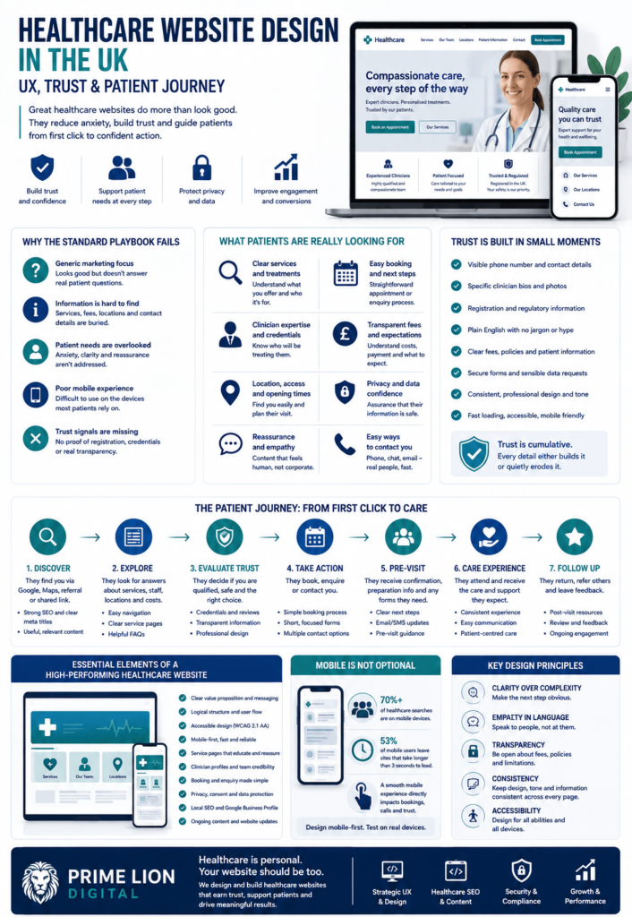
Trust is built in small moments, not just in big claims
Healthcare brands often assume trust comes from credentials alone. Credentials matter, of course, but online trust is cumulative. It is formed through dozens of small interactions.
A visitor notices whether the phone number is easy to find. They notice whether clinician biographies are specific or generic. They notice whether registration details are present without being hidden. They notice whether fees are explained plainly or avoided. They notice whether the site works properly on a mobile connection. They notice whether forms ask for excessive information too early.
In UK healthcare website design, trust usually comes from a combination of signals:
- clear service descriptions written in plain English;
- visible clinician, practice or organisation credentials;
- accurate location, contact and opening information;
- sensible privacy and consent handling;
- professional tone without exaggerated claims;
- accessible, stable page layouts that do not feel chaotic.
None of that is glamorous. All of it matters.
The patient journey starts before the homepage
One of the most common design mistakes is to imagine the patient journey beginning on the homepage. It often does not. A user may enter via a treatment page from Google, an FAQ from an AI overview, a location page from Maps, a clinician profile shared by referral, or a blog article answering a symptom-related question.
That means every meaningful landing page has to do more than rank or look tidy. It must orient the visitor quickly. What is this service? Who is it for? Is this NHS, private or mixed? Where is it offered? What is the next step? Can I call? Can I book? Can I read more before deciding?
Healthcare content architecture matters here as much as interface design. If the website structure forces users to restart their journey on the homepage to understand the basics, the experience feels brittle. Good patient journey design assumes messy entry points and builds resilience into the navigation, content and conversion paths.
Why UX matters commercially even when the page is purely informational
This is where some teams still misread the situation. They treat informational pages and conversion pages as separate assets. In healthcare, they are tightly connected. A page explaining diagnostics, therapy, treatment options or referral routes may not be designed as a hard conversion page, but it has direct commercial and operational impact.
Better UX reduces drop-off, lowers avoidable calls, improves lead quality, increases booking confidence, shortens decision time and reduces admin friction. It also filters demand more effectively. A well-designed page helps the right patients move forward and helps the wrong-fit enquiries self-correct earlier.
That is not simply a marketing win. It affects reception teams, patient coordinators, clinicians and operations. Poor website UX creates downstream workload. Staff end up answering questions the site should have handled.
Different healthcare organisations face different journey problems
The patient journey for a local GP practice is not the same as that of a cosmetic clinic, private consultant, dental group or specialist therapy provider. Even within the same sector, the journey changes depending on urgency, sensitivity, pricing model and referral pathway.
A fertility clinic user may need discretion, detailed process information and confidence around next-step conversations. A physiotherapy patient may want fast booking, insurance information and location convenience. A mental health visitor may need softer language, reduced cognitive load and low-friction first contact. A hospital group may need to support consultant-led pathways, self-pay decisions and complex service discovery across multiple locations.
The design implication is obvious but often overlooked: there is no generic patient journey. Healthcare web design in the UK works best when the site reflects the actual decision pattern of the audience rather than a standard brochure structure.
Where many healthcare websites quietly lose trust
Trust does not usually collapse because of one dramatic flaw. More often, it erodes through accumulation. An outdated page here. An unclear booking button there. Vague promises. Missing fees. Thin clinician biographies. Overwritten service pages. Inconsistent terminology between navigation and content. Forms that feel too intrusive. Mobile layouts that bury essential information halfway down the page.
That erosion matters because healthcare users are unusually sensitive to inconsistency. If the site looks polished but the details feel neglected, the gap is noticed. In most sectors, that may be interpreted as poor upkeep. In healthcare, it can trigger doubts about professionalism more broadly.
There is also a subtler issue: some healthcare sites borrow the visual language of luxury consumer brands or fast-growth startups. Occasionally that works. Often it creates the wrong tone. Patients generally do not want theatre. They want calm, clarity and competent reassurance. For organisations weighing healthcare website redesign decisions, that distinction matters more than trend-following.
Why patients judge credibility faster than providers expect
Most users do not begin by assessing clinical depth. They begin by asking whether the site feels safe to trust. That judgement is often made from small details: whether the page is easy to scan, whether clinicians are visible as real people, whether contact routes feel straightforward, and whether the next step is explained without pressure. In healthcare, hesitation often appears before a visitor has read very much at all.
Accessibility is not an add-on in UK healthcare UX
Accessibility discussions are sometimes treated as a technical checklist to be handled late in the project. That approach is especially weak in healthcare. A large proportion of users may be older, stressed, in pain, neurodivergent, visually impaired, temporarily impaired, or accessing the site under difficult conditions on a mobile device.
So accessibility is not just about WCAG compliance language. It is about practical usability: readable type, clear contrast, obvious interactive elements, sensible form design, descriptive labels, predictable navigation, and content that does not assume perfect concentration.
UK healthcare organisations should also remember that accessibility failures do not only exclude users at the margins. They often reveal a broader UX weakness that affects everyone. If a page is hard to parse for a screen reader user, it is often hard to parse for a tired or anxious user as well.
A patient-task lens is often more useful than a page-type lens
Healthcare websites are easier to evaluate when teams look at what a visitor is trying to do rather than which template they are on. In practice, most journeys revolve around a small set of tasks: checking whether a service fits, verifying trust, understanding the next step, making contact or booking, and preparing for the visit. When those tasks are easy, the site usually feels clear. When they are fragmented across pages, trust and momentum both weaken.
Content design is doing more work than most teams realise
In healthcare website design, content is not decorative. It carries explanation, reassurance, expectation-setting and risk reduction. That is why thin copy is so damaging. A service page that says little more than “we offer expert care tailored to your needs” does not help a visitor make a decision. It sounds safe internally and useless externally.
Strong healthcare content tends to answer the questions patients are slightly nervous about asking. What symptoms or concerns might lead someone to seek this service? What happens at the first appointment? Is a referral needed? How long does it take? Are there different treatment options? Is there aftercare? Who delivers it? What are the limits of the service?
That does not mean every page should become a textbook. Quite the opposite. The best healthcare content is selective, clear and responsibly specific. It reduces uncertainty without becoming clinically unreadable.
Forms, booking journeys and patient confidence
If there is one area where UX and trust meet most visibly, it is the handover from reading to acting. The user has decided to call, enquire or book. Now the interface has to support that decision without creating new doubt.
Healthcare booking flows fail when they ask too much too soon, split the journey awkwardly, hide key information, or leave patients unsure whether anything has actually happened. Confirmation matters. Response-time expectations matter. Alternative contact routes matter.
There is a difference between data that is operationally useful and data that is essential at the first interaction. Many services collect too much up front because it seems efficient internally. For a nervous patient, though, a long medical-style form before any human contact can feel like a barrier rather than a convenience.
Sometimes a shorter first-step form and a stronger follow-up process is the better design decision. Not always, but often. Where providers need non-standard booking logic, integrations or tailored patient pathways, custom web development for more complex journeys can become relevant for practical rather than aesthetic reasons.
Privacy, reassurance and the UK expectation of digital seriousness
Healthcare users are naturally more alert to confidentiality than the average consumer. They may not quote UK GDPR principles or ask how data is stored, but they are paying attention to cues. Does the form explain why information is being requested? Is consent language sensible? Are privacy links easy to find? Does the booking process feel secure? Is there any sign of careless handling?
Trust in healthcare is partly clinical, partly operational and partly digital. A beautifully branded site that handles personal information clumsily undermines itself very quickly.
For providers operating in regulated or semi-regulated contexts, the website also has to support credibility through accurate governance signals: registration details, policy access where appropriate, safeguarding clarity, complaints routes, insurer relationships if relevant, and clear ownership of the organisation. These are not merely footnote items. For many users, they are part of the decision journey.
Mobile-first is not enough if the journey is still desktop-minded
Most healthcare websites now claim to be mobile-friendly. That is a low bar. The harder question is whether the patient journey has genuinely been designed for mobile behaviour.
People searching for healthcare on mobile are often in transit, between tasks, in discomfort, or comparing options quickly. They do not want elegant complexity. They want fast comprehension. Can they call in one tap? Can they find the clinic? Can they read the essentials without expanding six accordions? Can they understand cost or referral information without opening a PDF?
Quite a few sites pass technical responsiveness tests while still behaving like desktop brochures squeezed into narrow screens. The layout technically adapts, but the cognitive load does not.
A few realistic scenarios that show where design choices matter
Consider a private dermatology clinic in London. A patient arrives from search on a treatment page, not the homepage. They want to know whether a specific condition is treated, whether they need a referral, who they might see and how soon an appointment is available. If the page opens with a large brand statement, a stock image and three paragraphs of general claims before answering any of that, the design has already missed the moment.
Now take a regional dental group. The website may look modern, but if emergency appointment information is buried and location pages are inconsistent, reception teams end up fielding unnecessary calls. That is a UX failure with operational cost.
Or a mental health provider. Here the language, pace and interaction design matter even more. Overwhelming menus, overly clinical copy, aggressive calls to action or cold intake forms can create drop-off before a conversation has even started. The right patient journey is not just efficient. It is emotionally calibrated.
What healthcare organisations often misunderstand about “modern design”
Modern design in healthcare is frequently mistaken for visual minimalism, animation, or premium brand aesthetics. Those things may have a place, but they are not the substance of the work.
A genuinely modern healthcare website is one that reflects contemporary user behaviour and institutional responsibility. It is built around search-led entry points, mobile use, accessibility, trust verification, content clarity, structured service discovery and operational follow-through. It is current not because it looks fashionable, but because it understands how patients decide.
That is why some visually modest healthcare sites outperform more expensive redesigns. They answer the right questions in the right order. They respect patient uncertainty. They make action simple.
The hidden friction is usually organisational, not just technical
When a healthcare website underperforms, the root problem is not always design execution. Often it is internal misalignment. Clinical teams want accuracy. Marketing wants clarity. Operations want fewer calls. Compliance wants caution. Leadership wants growth. Each of those priorities is legitimate, but if nobody owns the patient journey end to end, the website becomes a compromise document.
You can usually see it in the final product. Pages become overloaded with caveats, stripped of useful detail, or built around internal department logic rather than patient logic. Navigation reflects the organisation chart. Copy sounds approved rather than helpful. This tends to be even more visible on larger provider estates, where corporate website structure and governance have a direct effect on how trust is presented.
This is one reason healthcare redesigns can drag on. The hard part is not choosing components or templates. It is deciding what the patient genuinely needs to know first, what can be simplified, and where internal risk-aversion is harming usability.
How to evaluate a healthcare website beyond appearances
If a healthcare organisation is reviewing its current site, the most useful questions are not aesthetic. They are behavioural and operational.
Can a first-time visitor understand the provider model quickly? Can they distinguish between services without reading everything? Are clinician pages credible and current? Does every major service page answer likely pre-booking questions? Is there a clear route for urgent, routine and exploratory enquiries? Does mobile use feel simple rather than merely possible? Are forms proportionate? Is trust visible in the details, not just in slogans?
There is also a blunt but revealing test: where are staff still compensating for the website? If receptionists repeatedly answer the same basic questions, if coordinators chase incomplete forms, if clinicians see patients arriving with the wrong expectations, the digital journey is not doing its job.
The build process matters as much as the final interface
Healthcare website projects can go wrong long before launch. Discovery is often rushed. Content migration is underestimated. Governance is unclear. Integrations with booking systems, CRMs or practice software are treated as a secondary task. Ownership after launch is vague. Then the site goes live looking improved but functioning only slightly better.
A stronger process usually includes content auditing, patient journey mapping, stakeholder alignment, accessibility review, form strategy, trust-signal planning, technical performance work and realistic post-launch governance. In other words, the website is treated as an operating system for communication, not just a branded asset.
That is especially relevant for organisations with multiple clinics, multiple specialisms or a mix of public-facing and referral-led pathways. Complexity compounds quickly if the information architecture is not settled early. In some cases, that points towards bespoke website design considerations; in others, it points to better structure and publishing discipline rather than more novelty.
Why healthcare redesigns often fail in content operations
A redesign can look cleaner and still leave the core service journey weak if nobody owns the content model behind it. Common failure points are familiar: outdated clinician profiles, unclear treatment naming, inconsistent enquiry routing, neglected FAQs, and no agreed priority order for patient paths. Front-end improvements help, but healthcare websites stay credible only when content ownership, update workflows and publishing responsibilities are properly defined.
Performance, maintenance and content governance are trust issues too
Healthcare teams do not always frame technical performance as part of trust, but users do. Slow pages, broken forms, expired content, outdated clinician information and inconsistent service details all signal neglect.
From a patient perspective, a website is not separate from the organisation. If the digital front door feels unreliable, confidence in the service itself can weaken. This is particularly true for new patients with no prior relationship.
Maintenance therefore matters more than many teams expect. Content governance, update workflows, version control for clinical information, and ownership of location or service pages are not back-office housekeeping. They shape trust over time. For many teams, the practical question is less about platform popularity and more about whether tools such as WordPress implementation choices or a broader CMS structure and publishing workflow genuinely support regular, accurate updates.
Search behaviour is changing, but the core patient need is not
People now discover healthcare providers through a more fragmented search environment: traditional search results, maps, AI-generated summaries, review platforms, social proof, referral links and local directories. That changes traffic patterns and entry points, but not the fundamental need behind them.
Patients still want confidence, clarity and a manageable next step.
That is why healthcare content and UX need to work together. If search surfaces a service page or clinician profile directly, that page has to stand on its own. If AI tools summarise part of the content, the underlying site still needs to provide depth, specificity and visible credibility when the user clicks through. Thin pages may gain impressions, but they rarely support real decision-making.
What better healthcare web design tends to look like in practice
Not flashy. Usually calmer than expected. More structured. Better written. More transparent. Less interested in selling a feeling and more interested in helping a person move from uncertainty to clarity.
In practical terms, that often means clearer service segmentation, stronger clinician pages, cleaner mobile journeys, better location logic, faster access to booking or contact routes, and more deliberate use of reassurance throughout the experience. It may also mean fewer words in some places and far more substance in others.
The strongest examples rarely feel over-engineered. They simply remove doubt at the right moments.
Questions worth asking before a redesign or rebuild
Before investing in a healthcare website project, organisations should be honest about what they are trying to fix. Is the issue low trust, weak lead quality, poor local visibility, confusing service architecture, operational inefficiency, outdated infrastructure, content decay or a mix of all of them?
That distinction matters. A site with strong trust but poor usability needs different decisions from one with good visual design but weak clinical credibility. Likewise, a practice struggling with patient drop-off during booking has a different problem from a specialist provider whose service pages fail to explain when referral is needed.
A better project starts with the patient journey, not the homepage mock-up. It also accepts that healthcare UX is cross-functional work. Design, content, development, compliance and operations all have a say because the patient experiences all of them together.
Where the UK market is heading
UK healthcare websites are moving, slowly but clearly, towards higher expectations of clarity, accessibility and digital trust. Patients increasingly expect online experiences to do more than display information. They expect triage logic, transparent next steps, cleaner booking, better mobile access and content that feels written for real decisions rather than brand theatre.
At the same time, regulatory awareness, privacy expectations and scrutiny around health claims are not going away. The organisations that respond well will not necessarily be the loudest. They will be the ones that combine credible information, disciplined UX and dependable operations.
That combination is harder than it sounds. It asks for more than a redesign. It asks for digital maturity.
The main takeaway
Healthcare website design in the UK is really about patient confidence under pressure. UX, trust and patient journey are not separate workstreams. They are different names for the same experience.
When the site is well designed, people feel oriented, reassured and able to take the next step. When it is poorly designed, they hesitate, second-guess, call unnecessarily or disappear altogether. The difference is rarely just aesthetic. It is structural, editorial and operational.
That is why the best healthcare websites tend to feel less like marketing assets and more like well-run digital front doors. They respect the seriousness of the moment. They make things clearer. And in healthcare, that clarity carries real weight.