

Why Your Ecommerce Website Gets Traffic but No Sales
Traffic is easy to misread. In ecommerce reporting, it looks like momentum. Sessions go up, impressions improve, paid campaigns keep delivering visitors, and the dashboard suggests something is working. Then the commercial picture tells a different story: carts stay empty, checkout completion remains poor, and revenue does not move in proportion to attention.
This is more common than many teams admit. A store can be visible, technically live, even reasonably busy, and still underperform because visibility and purchase intent are not the same thing. Nor are visits and trust. A website can attract people and still fail to give them a convincing reason to buy.
Leave your details and our team will get back to you shortly to discuss your website, SEO or digital growth project.
The uncomfortable part is that the problem is rarely just “low conversion rate” in the abstract. Usually there is a chain of friction: weak offer clarity, mismatched traffic, poor page hierarchy, slow decision-making journeys, unclear delivery information, mobile UX problems, and a checkout that asks for confidence before the site has earned it.
When traffic creates the illusion of health
A growing ecommerce site often reaches a point where the team starts celebrating reach before understanding behaviour. More visitors, more product page views, more ad clicks. On paper, that can look like healthy demand. In practice, a lot of that traffic may be lightly interested, comparison-driven, accidental, or simply too early in the buying cycle.
That distinction matters. Not all traffic is commercial traffic. A visitor reading sizing guidance, checking opening hours, comparing colours, or landing on a collection page from a broad query may never have been close to purchasing. If enough of those visits are mixed into reporting, the site can look busy while remaining commercially weak.
This is one reason conversion problems are often diagnosed too late. Teams focus on acquisition because it is easier to measure at volume. Sales friction is messier. It sits across design, product data, merchandising, payment methods, page speed, trust signals, and operational policy. No single chart tells the whole story.
The real issue is usually not one thing
Most underperforming ecommerce websites do not fail because of a dramatic technical flaw. They fail quietly through accumulated hesitation. A visitor lands on the site and experiences a series of small doubts: Is this product right for me? Is this price fair? Can I trust the returns process? Will delivery take too long? Why is the product information so thin? Why is the add-to-basket button competing with three other distractions?
Each doubt seems minor. Together they suppress action.
This is why stores with similar traffic volumes can produce very different revenue outcomes. One site reduces uncertainty quickly. The other leaves the customer to do too much interpretive work. Online, that gap is expensive.
Where sales usually break down
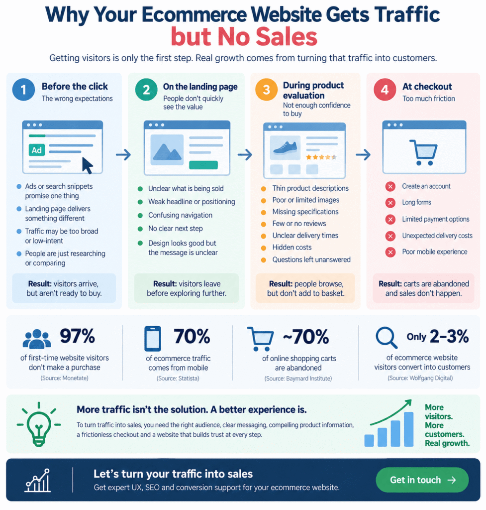
If an ecommerce website gets traffic but no sales, the weakness is often happening in one of four places: before the click, on the landing page, during product evaluation, or at checkout.
Before the click, the problem is expectation. Ads, search snippets, social content, or email messaging may promise one thing while the landing page delivers another. The visitor arrives ready for a specific answer and instead finds a generic category page or vague homepage positioning.
On the landing page, the problem is orientation. People need to understand quickly what is being sold, who it is for, what makes it credible, and what to do next. If the design is attractive but the path is muddy, aesthetics will not compensate.
During product evaluation, the problem is confidence. This is the point where thin descriptions, poor imagery, missing specifications, weak reviews, unclear shipping, and hidden costs hurt the most. A customer who cannot resolve practical questions will pause the purchase.
At checkout, the problem is friction. Mandatory account creation, awkward forms, limited payment options, surprise delivery costs, or mobile usability issues can collapse otherwise strong purchase intent in seconds.
Traffic quality is often the first uncomfortable truth
It is entirely possible to attract the wrong audience efficiently. Broad search visibility, social reach, display campaigns, and top-of-funnel content can send people to the site who are curious but not commercially ready. The volume looks good. Revenue does not follow.
A classic example is ranking for informational queries when the page experience is transactional, or running paid campaigns around broad category terms when the product offer is niche, premium, or specialised. In both cases the site receives visits, but the visitor arrives with a mindset that does not match the page’s commercial demand.
That is not a traffic problem in the simple sense. It is an intent alignment problem.
Teams often respond by trying to “improve conversion” while leaving this mismatch untouched. That rarely works for long. Better UX cannot fully rescue traffic that never had meaningful buying intent to begin with.
Why product pages carry more commercial weight than many brands realise
On many ecommerce sites, the product page is where the sale is truly won or lost. Yet it is often treated like a template output rather than a commercial decision environment.
A good product page does not just display an item. It reduces uncertainty in the order the customer feels it. First relevance, then desirability, then proof, then practical reassurance. When those elements appear in the wrong order, or are too weak, conversion suffers even if traffic volume is perfectly respectable.
This is one reason the ecommerce website structure and user journey matter beyond layout. The real question is whether the page helps someone make a confident decision without forcing them to hunt for answers. Design that looks polished but leaves basic commercial questions unresolved tends to underperform.
There is also a structural issue. Many product pages are built from catalog logic rather than buying logic. They list attributes, but do not explain why those attributes matter. They show images, but not usage context. They present a price, but not value. They mention delivery, but not timing clearly enough to remove hesitation.
What businesses often misunderstand about conversion
There is a persistent belief that conversion is mainly a CRO issue at the end of the journey. Change the button colour, shorten the form, test a headline. Those things can help at the margins. They are not usually the root cause when an ecommerce store gets traffic but no sales.
The deeper issue is often that the site has not earned the transaction. Visitors are being asked to buy before the commercial story makes sense. That story is built from merchandising, UX, pricing logic, navigation, search, fulfilment clarity, stock confidence, device experience, and operational credibility.
Another misunderstanding is assuming that more information always means better conversion. Not necessarily. The problem is not simply quantity. It is relevance, sequencing, and clarity. Customers need the right information at the right moment. Too little creates doubt. Too much, delivered badly, creates fatigue.
The hidden role of trust in low-conversion stores
Trust is one of the least visible causes of weak ecommerce performance because it rarely appears as a single error in analytics. People do not always abandon because something is obviously broken. Sometimes the site just does not feel sufficiently dependable.
That feeling can come from subtle signals: inconsistent branding, weak photography, generic copy, hard-to-find returns information, missing company details, unclear support access, limited reviews, or checkout pages that look disconnected from the rest of the experience.
For newer brands, this challenge is sharper. Established retailers can survive with mediocre UX because they borrow trust from reputation. Smaller ecommerce businesses do not have that cushion. Their website has to do more of the credibility work on its own.
In practice, trust is often the bridge between browsing and buying. Without it, interest remains interest.
Mobile performance is still quietly costing stores money
Many ecommerce teams know mobile traffic is high, but they still review the site mainly on desktop. That gap leads to bad decisions. A journey that feels manageable on a large screen can become clumsy on mobile: sticky elements covering content, gallery interactions that frustrate users, oversized forms, slow cart updates, awkward coupon fields, and payment flows that feel longer than they are.
None of this sounds dramatic in a meeting. On a phone, it is enough to stop a sale.
The practical test is simple: can a first-time visitor discover, compare, trust, and purchase comfortably with one hand, limited patience, and patchy concentration? If not, the site may be generating traffic efficiently while bleeding revenue in the most common browsing environment.
Checkout problems are often symptoms, not the disease
When businesses see basket abandonment, they naturally blame checkout. Sometimes they are right. Hidden fees, weak payment choice, and cumbersome forms can do serious damage. But not all abandonment means checkout is the primary problem.
Often, hesitation started earlier. The customer added an item as a holding behaviour, not as a firm buying decision. By the time they reached checkout, unresolved doubts resurfaced: shipping cost, delivery speed, return risk, size confidence, or overall value. Checkout simply became the point where uncertainty turned into exit.
That is why pure checkout optimisation, while valuable, can disappoint if product and category pages remain weak. Conversion improvement works best when the whole decision path is treated as one system rather than a set of disconnected screens. In practice, that is where focused ecommerce optimisation work tends to matter more than isolated checkout tweaks.
Operational realities matter more than glossy redesigns
Sometimes the website is blamed for commercial issues that are partly operational. Delivery windows are unreliable. Stock levels are inaccurate. Customer service responses are slow. Product data is inconsistent across the catalogue. Promotional logic is confusing. These are not cosmetic problems, and customers detect them surprisingly quickly.
A well-built ecommerce platform can help reduce this friction, especially when catalogue structure, search behaviour, filtering, integrations, and checkout flows are properly considered in the underlying custom ecommerce development approach. But technology alone does not solve weak business logic. It simply exposes it more clearly.
This is especially true in more complex buying models. In B2B ecommerce, for instance, low conversion may have less to do with desire and more to do with account permissions, pricing visibility, quote workflows, procurement expectations, or repeat ordering friction. The traffic is still real. The conversion obstacles are just different.
A few familiar scenarios
Consider a premium homeware brand attracting steady organic and paid traffic. Category pages are visually refined, but product pages are sparse, delivery details are buried, and returns wording is vague. Visitors browse, maybe even add items to basket, but many leave before purchase because the perceived risk remains too high for the price point.
Or take a fast-growing store with strong campaign traffic and a healthy social following. The homepage tells a brand story well enough, but landing pages are generic, product variants are confusing, and checkout feels cluttered on mobile. Commercial intent exists, but the path from interest to purchase is full of tiny interruptions. That pattern is common in Shopify builds where theme decisions, app layering, and presentation logic have evolved faster than the buying journey.
A similar pattern appears on WooCommerce stores that have expanded quickly. The store starts simple, then gains plugins, layered shipping rules, inconsistent templates, and uneven performance. On the surface it still works. Under pressure, it becomes fragile. Conversion drops not because the platform is inherently weak, but because the implementation has become commercially messy.
The diagnostic questions worth asking before changing anything
Before redesigning the whole store, it helps to ask a few harder questions.
- Is the traffic commercially relevant, or merely plentiful?
- Do landing pages match the promise made before the click?
- Can a first-time buyer understand delivery, returns, pricing, and product fit without hunting for answers?
- Does the mobile journey feel genuinely easy, not just technically functional?
- Are users abandoning because checkout is poor, or because confidence was never built earlier in the journey?
Those questions sound obvious, but they force a shift from vanity metrics to buying conditions. And that shift tends to reveal more than another dashboard review.
Why optimisation is usually cumulative, not dramatic
There is a habit in ecommerce of looking for the single fix. The one test, the one redesign, the one plugin, the one campaign adjustment that suddenly makes sales appear. In reality, improvement is more often cumulative. Clearer hierarchy, better product content, faster mobile interactions, smarter filtering, stronger trust presentation, better payment options, tighter landing-page relevance. None of these changes may look revolutionary on their own. Together they can materially alter conversion performance.
The best optimisation work tends to look almost unremarkable from a distance. It simply makes buying feel easier, safer, and more obvious.
Platform choice can amplify existing weaknesses
Sometimes traffic without sales points to a mismatch between business model and platform setup. A store with complex product logic, unusual bundling, subscription behaviour, or layered pricing may struggle if it is being forced into a setup designed for simpler retail patterns.
That does not mean every low-conversion site needs a rebuild. It does mean the architecture behind the experience deserves scrutiny. Some businesses outgrow their original setup quietly. Performance issues increase, merchandising becomes harder to manage, and customer journeys start reflecting internal workarounds rather than deliberate design.
If the site cannot support the buying behaviour your model requires, traffic alone will not rescue it.
Why internal teams and agencies sometimes miss the obvious
Low conversion is hard to diagnose partly because responsibility is distributed. Marketing sees traffic quality. Design sees layout. Development sees functionality. Operations sees fulfilment constraints. Customer service hears complaints. Leadership sees revenue. Everyone is looking at a real piece of the puzzle, but not always the whole system.
That fragmentation creates a familiar problem: each team improves what sits in front of them, while the customer experiences the combined friction of everything at once.
It is also why “the site looks good” is such a dangerous conclusion. Visual quality does not equal buying clarity. Many underperforming ecommerce websites are aesthetically competent. Their weakness is commercial usability, not appearance.
What better-performing stores usually do differently
Stronger ecommerce sites tend to remove ambiguity early. They make category intent clearer. They help users narrow choice fast. Their product pages answer practical objections before the customer consciously forms them. Delivery and returns are easy to find. Price context is sensible. Mobile journeys are stripped of avoidable noise. Checkout feels like completion, not another decision phase.
They are not always more beautiful. They are more decisive.
Just as importantly, they are usually built and maintained with a better understanding of how acquisition, UX, platform behaviour, and operations intersect. That is the thread running through most effective ecommerce systems: commercial coherence.
If you need a practical way to investigate the problem
Start with behaviour, not assumptions. Look at landing-page intent by source. Review where engaged users stall. Watch mobile sessions. Check whether high-traffic pages are actually commercially useful. Read customer service logs beside analytics. Audit what a first-time buyer cannot easily understand in under a minute.
Then prioritise issues by revenue effect, not by how visible they are internally. A homepage refresh may feel satisfying. Fixing product-page confidence gaps may be worth far more. Rebuilding navigation may matter less than clarifying shipping thresholds. Replacing the platform may be unnecessary. Or it may be overdue. The point is to diagnose before you decorate.
The broader commercial consequence of ignoring the gap
A website that attracts traffic but does not convert does more than miss sales. It distorts planning. Teams overestimate brand strength, underestimate friction, and keep funding acquisition to compensate for structural weaknesses. Margin gets squeezed. Reporting grows noisier. Decision-making becomes reactive.
Over time, the business starts normalising inefficiency. Poor conversion becomes background reality rather than a fixable commercial problem. That is costly, not just in revenue, but in strategic clarity.
What this means going forward
Ecommerce is not getting more forgiving. Customers compare faster, hesitate less, and abandon more casually than they used to. Expectations around speed, clarity, trust, and convenience are now baseline expectations, not differentiators.
That means the old comfort of “we have traffic, so we must be close” is increasingly unreliable. Sometimes you are close. Often you are still asking the site to do commercial work it has not been designed, built, or maintained to handle well enough.
The useful question is not whether people are visiting. It is whether the buying journey deserves the attention it is receiving.
Final thought
If your ecommerce website gets traffic but no sales, the answer is rarely mysterious. It is usually distributed. A little intent mismatch here, a little trust friction there, weak product communication, awkward mobile interactions, operational uncertainty, checkout hesitation. Small leaks, stacked together.
That is frustrating, but it is also workable. Because once the problem is understood as a system rather than a headline metric, it becomes far easier to improve what actually matters: not visits, but decisions.